


Product standout & shelf presence are a key concern for any food and drink brand. Packaging is your first impression and needs to resonate and attract consumers in increasingly competitive categories.
By making use of more specialised print treatments you can focus a consumers attention, and gain shelf blocking and standout in a retail environment
Daniel Hinde (Founder & Creative Director Greatergood Brands)
Here we’ve selected a few of our favourite packaging design finishes for food retail success…
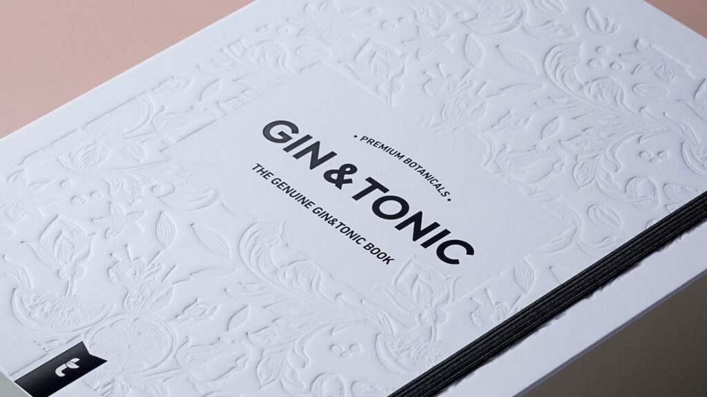
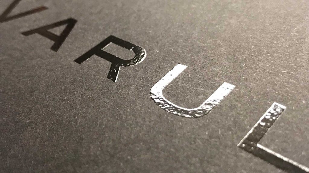
Embossing/Blind Embossing
Embossing or debossing is the process of creating a raised/recessed image on packaging. This adds a textural effect to packs which further compliments products of a more premium nature.
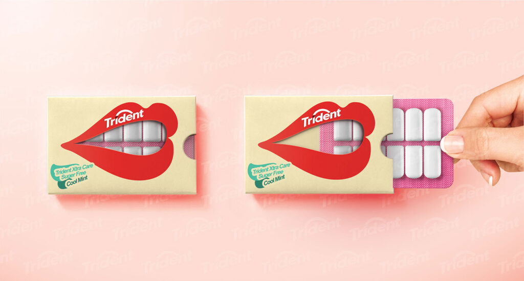
Diecutting For Product Windows
Diecutting is the process of a shape being cut from stock (paper). In food retail, product windows can be crucial and a perfect opportunity to create something unique and memorable with real shelf standout.
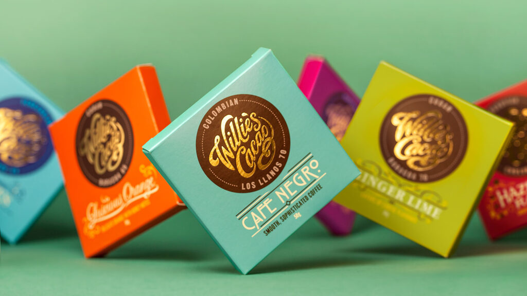
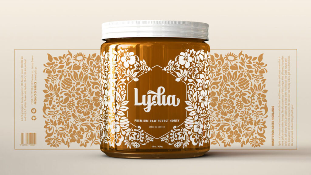
Gold/Colour Foiling
Gold and colour foiling have long been favoured in the food and drinks industry and are available in a wealth of colours. There are also options to suit all budgets with the choice of hot and cold foiling applications.
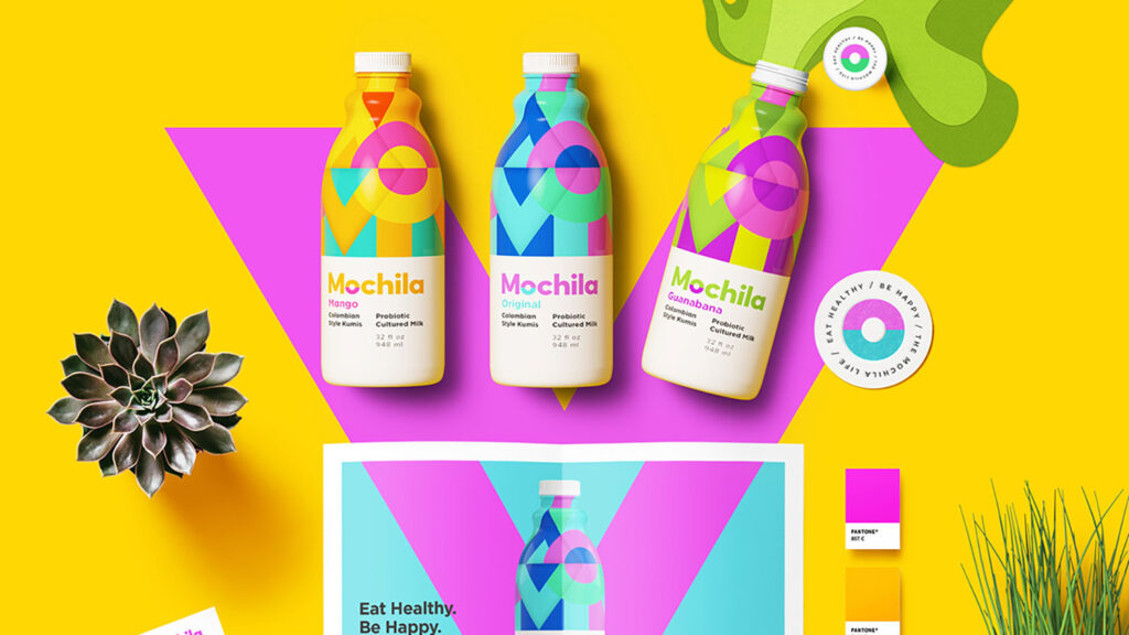
Neon, Fluorescents & Pastel inks
For bolder brands and products that need to leap off the shelves – neons and fluorescent inks can be used easily with processes like Pantone Neons. Looking for something a bit more discerning? Pantone Pastels come in a wealth of beautiful softer tones.
Spot UV
This is the process of applying a transparent gloss to design elements on pack. Perfect for adding depth and layers to illustrations, or making logos and typography pop.
Transparencies & White Inks
A great deal of creativity can be had with transparency across labels and films. White inks can add visual interest, purity and impact to your product category.
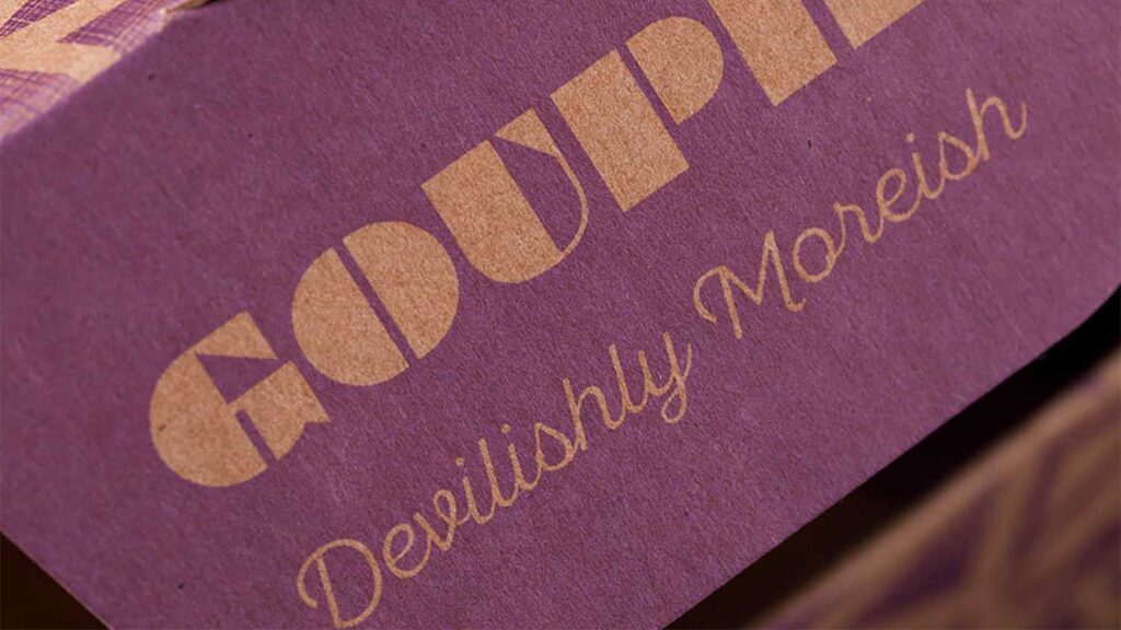
Stocks, Finishes & Texture
Different stocks and paper textures deliver a unique feeling to your brand. A soft touch satin can enhance a luxury label, whereas an uncoated ‘natural’ paper can help to position a more natural product.
Have a current or upcoming packaging design project? Get in touch to hear about our work with clients big and small across FMCG packaging design.
Sign up to our newsletter for free insights on all things brand, consumer, FMCG & CPG.
More Insights
 FMCG & CPG Marketing Strategy: Free Template
- How To Build A FMCG Brand
- Why Brand Guidelines Are Important – 10 Reasons
- Frozen Food Packaging Design – 5 Key Considerations
- Food Packaging Design – 10 Tips On Labelling Compliance
- FMCG Digital Marketing Strategies on a Shoestring – 8 Ideas
- 7 Tips for Product SKU Naming for FMCG Food & Drink Brands
- Effective Experiential Marketing Activations for FMCG & CPG Consumer Brands – 10 Tips
- Designing Effective SRP Packaging Design for FMCG & CPG Brands – 8 Tips
- Brand Storytelling – 15 Tips for FMCG Brand Storytelling
- Successful Packaging design in DTC & E-Commerce – 8 Tips
- Food Packaging Design – Designing for Limited Editions


Leave a Reply