In the fast-paced world of FMCG, where products move swiftly from production to consumer’s hands, accurate and compliant food packaging design labelling is crucial.
Ensuring that your FMCG brand adheres to labelling regulations fosters consumer trust and also safeguards your brand’s reputation. In the UK market, specific guidelines govern labelling practices. The cost of getting it wrong? Product recalls, retailer delistings, and consumer health concerns.
In this post, we’ll delve into the importance of labelling compliance for food packaging design, offering ten essential tips to navigate the intricate landscape of regulations and best practices.
1. Understand the labelling regulations which apply to your food product (and the markets you will sell into)
- Understand the labelling regulations which apply to your food product (and the markets you will sell into)
- Familiarize yourself with the extensive guidelines set forth by regulatory bodies like the Food Standards Agency (FSA) and the Trading Standards Institute (TSI). Knowing the specific requirements for your product category is foundational to compliance.
- GOV UK is a great starting point, here.
- Your local trading standards office can also offer advice on FMCG labelling.
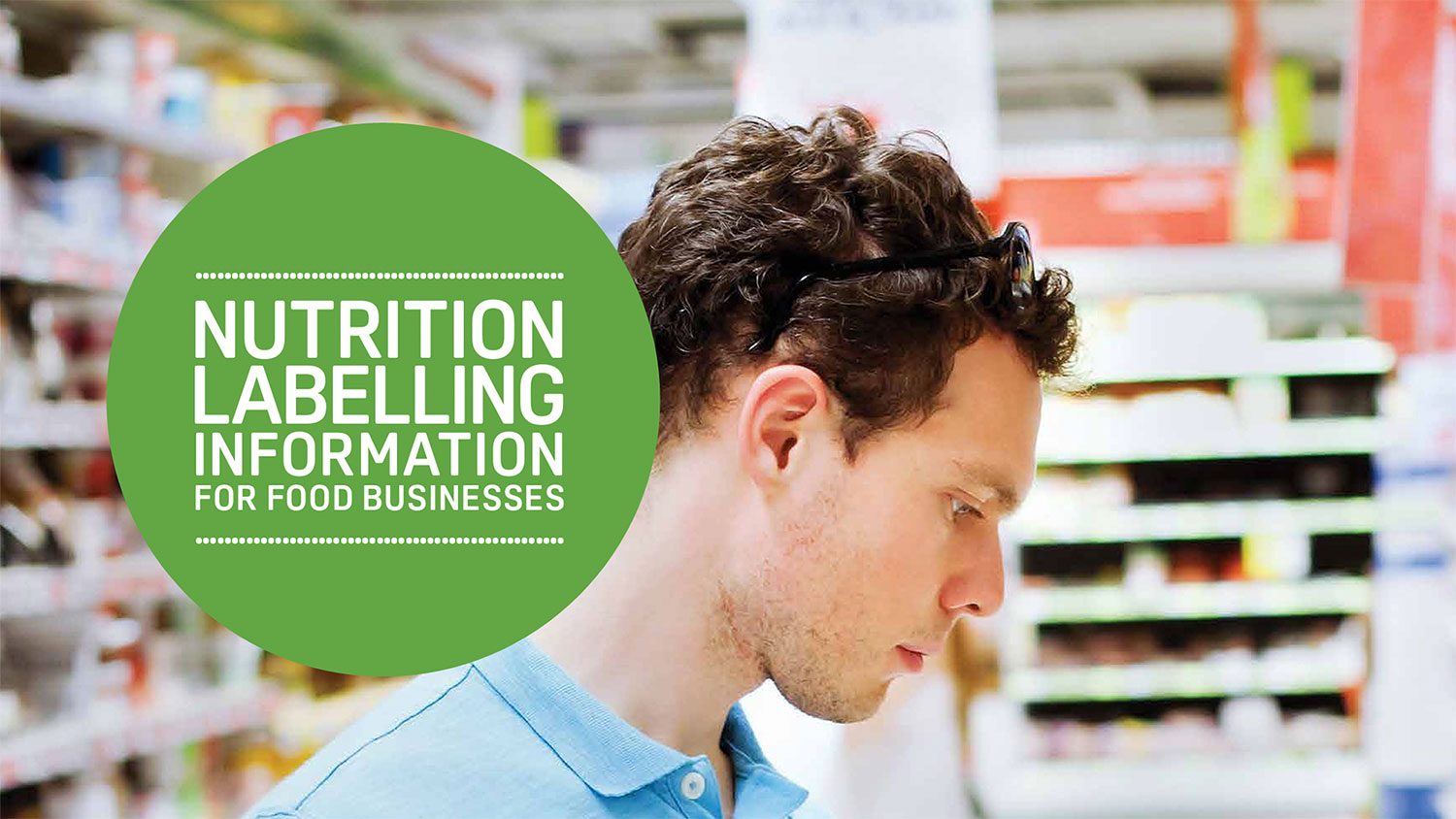
2. Ensure accurate ingredients declarations
- Provide a detailed and accurate list of ingredients used in your FMCG product.
- Ensure that potential allergens are clearly highlighted, meeting the UK’s strict allergen labelling rules.
- Understand the difference between labelling on ingredients like “natural flavourings”.
- Your product may contain processing aids which may not need to be listed in the ingredients list.
- Rules can differ across products – ensure you have an understanding of the legal definition of your product, and the rules which apply to it.

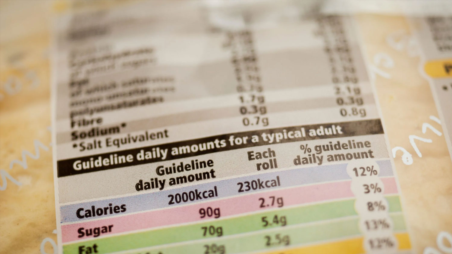
3. Nutritional information clarity
- Clearly present nutritional values, adhering to standard formats. This empowers consumers to make informed choices about their purchases.
- Nutritional values in a column are much easier and more prominent for consumers to read quickly rather than in a paragraph list.
- If your product is a “better for you” offering, and you want consumers to really see the value in your product and the nutritionals, make sure this is taken into consideration in your packaging design, and not as an afterthought.
- Creating a functional product? Make sure to include the RI values which reference your functional ingredient nutritionals. Nutritional information can be gained through calculations, or sending your product off for nutritional analysis.
4. Use clear and legible fonts
- Opt for fonts that are easily readable.
- Ensure all mandatory information is accessible to consumers.
- Avoid elaborate or overly stylized fonts that might impede legibility. Ingredients lists, nutritionals, and legal information should always be presented in a secondary brand font which is easy to read.
- Allergens should be clearly bold, if your brand typography doesn’t have a suitable typeface for this opt for an alternate.
- This typography legally needs to be in a readable size (currently 1.2mm X Height). Getting mockups created of packaging prior to a full production run can minimise costly mistakes with labelling and legibility issues.

5. Use correct use of language – keep brand tone of voice to a minimum
- In the UK, labels must be presented in English.
- If additional languages are included for export, ensure they are also presented accurately and clearly.
- Keep brand tone of voice in legal messaging to a minimum, copy here should be quick and easy for consumers to read and digest.
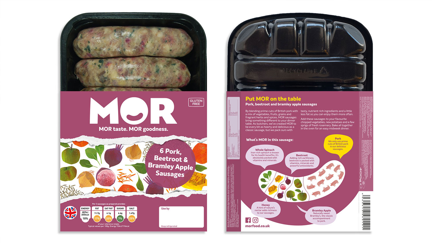
6. Provide clear allergen information
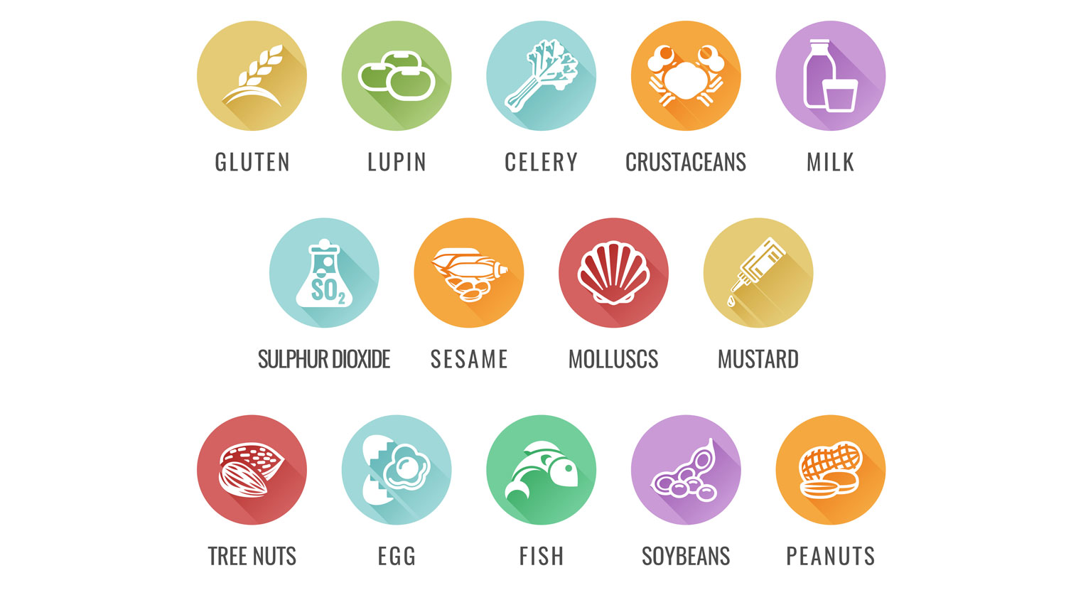
- Identify any potential allergens in your product, following UK regulations strictly. Make this information unambiguous and easy to find.
- Understand the difference between ingredient allergens, and allergens which may come into contact through your manufacturer.
- Allergen transparency is crucial with no room for mistakes or misunderstandings by the time your product hits the shelves.
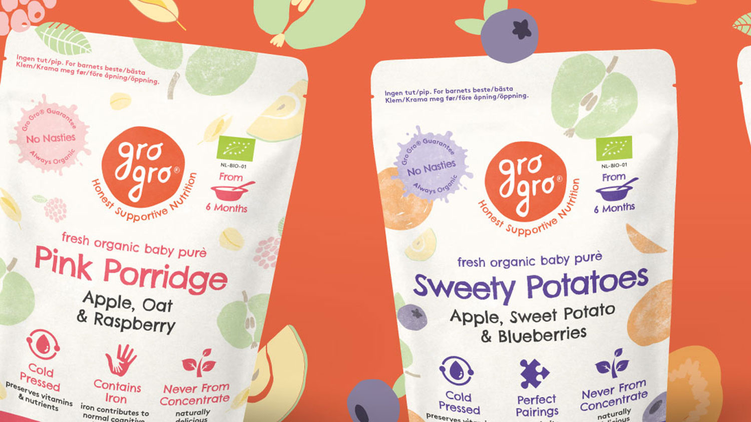
7. Highlight special claims or “virtues” correctly
- If your product carries special characteristics, such as organic, gluten-free, or vegetarian, ensure these claims are clearly displayed and compliant with UK regulations.
- Bringing a functional product to market? Make sure you have correctly understood your functional claims, and how much needs to be in your product to make a claim (make sure this is worded with precision).
- Check out our post on “5 Second Rule – 15 Tips for Effective Front of Packaging Messaging”.
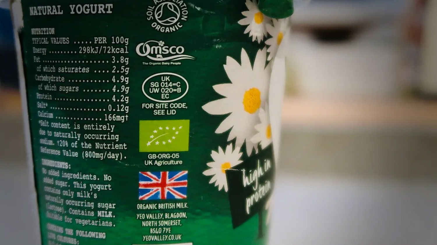
8. Get your recycling and legal symbols correct
- Incorporate the appropriate recycling symbols to inform consumers about how to responsibly dispose of packaging.
- Ensure any additional logos, symbols and icons used on your packaging are correct – for example, you should only be claiming “organic” and using the organic logo, if your product has been certified organic.
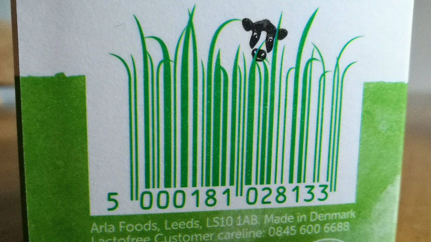
9. Design your barcode for ease of scanning and legibility
- Ensure your barcode is featured on your packaging at the correct size (relative to the overall packaging size).
- Barcodes should be in a considered and easy-to-find location for consumers (who may be scanning at self-service).
- Barcodes can have some additional design flair (generally from the tops of the barcodes works better), make sure to trial barcodes before a full print run to ensure any edits like this have not rendered the barcode difficult to scan.
- Understand best practices for barcodes for your category and product (for example, drinks barcodes are usually always featured vertical for ease of scanning).
10. Regularly update packaging and labels for compliance
- Stay vigilant about changes in labelling regulations. Regularly review and update your labels to ensure ongoing compliance with UK standards.
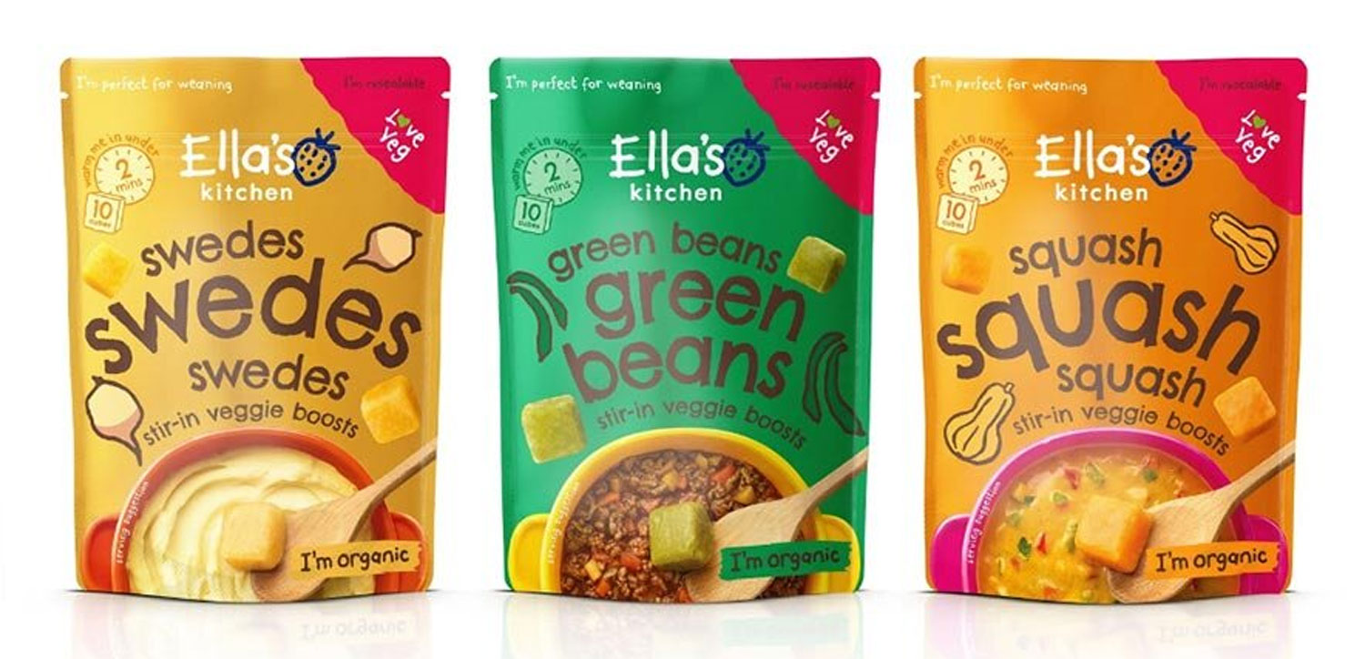
Labelling compliance is not only a legal requirement but a testament to your commitment to consumer safety and satisfaction. By following these ten tips and staying attuned to evolving UK regulations, your FMCG brand can navigate the complexities of food packaging design labelling with confidence.
Looking to start a food or drink packaging design project?
Get in touch to hear how we have worked with other clients across food packaging design, brand strategy and more.
Get in touch

Greatergood Brands®
Daniel Hinde is the Founder & Creative Director of Greatergood Brands. Daniel has over 20 years commercial experience building brands for global household names and disruptive challenger brands.
Sign up to our building better brands newsletter
Free insights for scaling brands

