The world of frozen food has been hotting up for some time now. Consumers understand that frozen can still mean fresh, if not fresher.
A whole host of challenger brands are challenging the status quo, driving real innovation and consumer value proposition. Frozen food packaging design has to perform harder and with more roles than standard ambient food packaging.
The frozen aisle has a host of different considerations to ambient.
In this article we look at 5 Key Considerations for Frozen Food Packaging Design…
1. Your Product Will Be Behind Frosted Glass
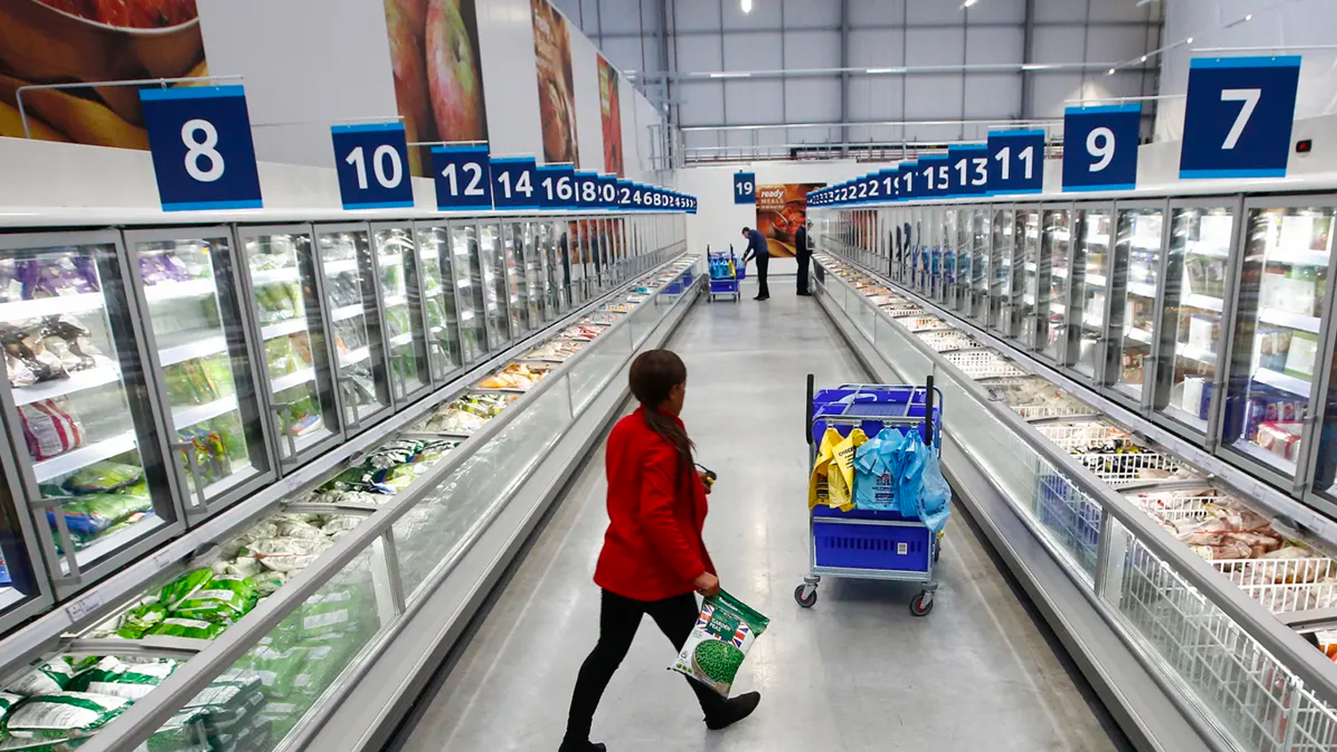
It is crucial to remember, unlike other categories, your product will be behind a closed door with frosted glass. Consumers are far less inclined to open freezer doors and inspect products closer. Packaging design, messaging, SKU name and hero callouts all need to be distilled down to the bare minimum.
The distance between consumer and product is likely to feel far greater when there is a door in between – trial this from a logistical point of view. Nothing is stopping you from trialing your packaging in a retail freezer and seeing how quick and easy your packaging is communicating.
2. Choose Colour Wisely – You Are Competing With Other Brands And A Sea Of Silver
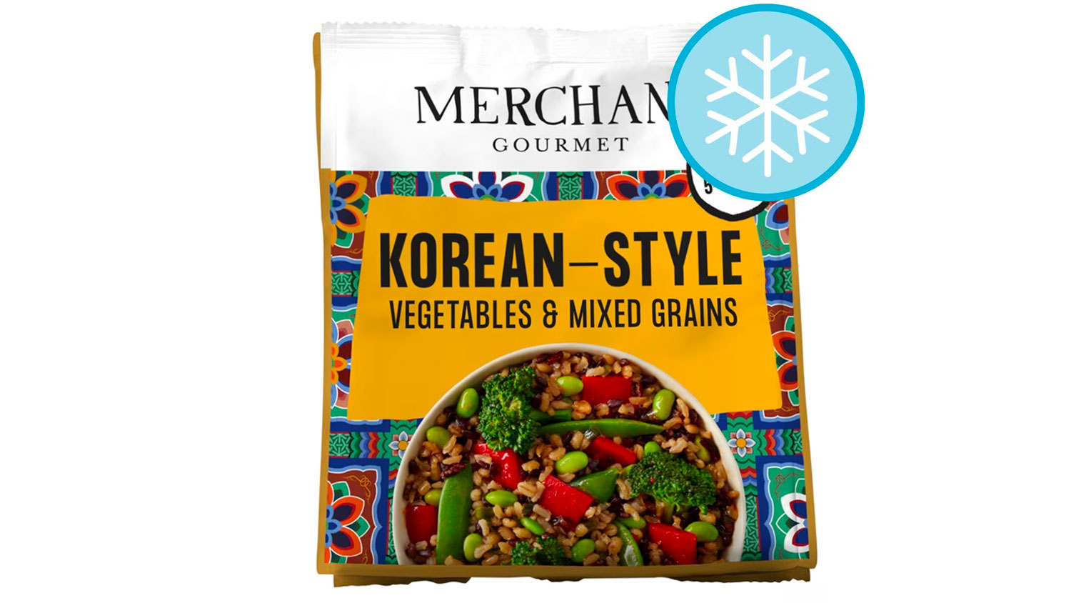
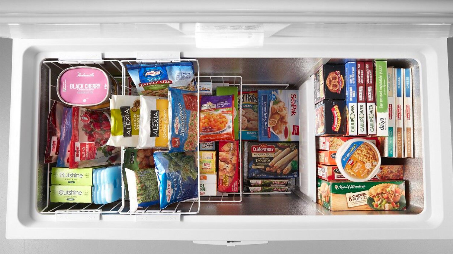
Colour is key in frozen food packaging design. Along with competing with other brands, you will be competing with a sea of silvery and white freezer framing and interiors. These aisles look distinctly different from ambient aisles, as much as the grocers try, they immediately look less exciting to shop in and are generally the last aisle and not a linger longer type of shopping experience.
Pick bold brand footprints wisely, choose colours which will help you add vibrance to this typically dull aisle and shopping experience.
3. Remember: Frozen Products Are Only Visible In Store
We have an even smaller window of time to make an impression in frozen, because frozen products are typically purchased to be stored away in the freezer. Unlike ambient products which may become a kitchen counter lingerer or a brand to be displayed, frozen products are not.
Think outside of the box – what can you add to your packaging or brand experience to get consumers to engage with your product slightly longer and create an emotional connection.
4. What Experience Are You Offering?
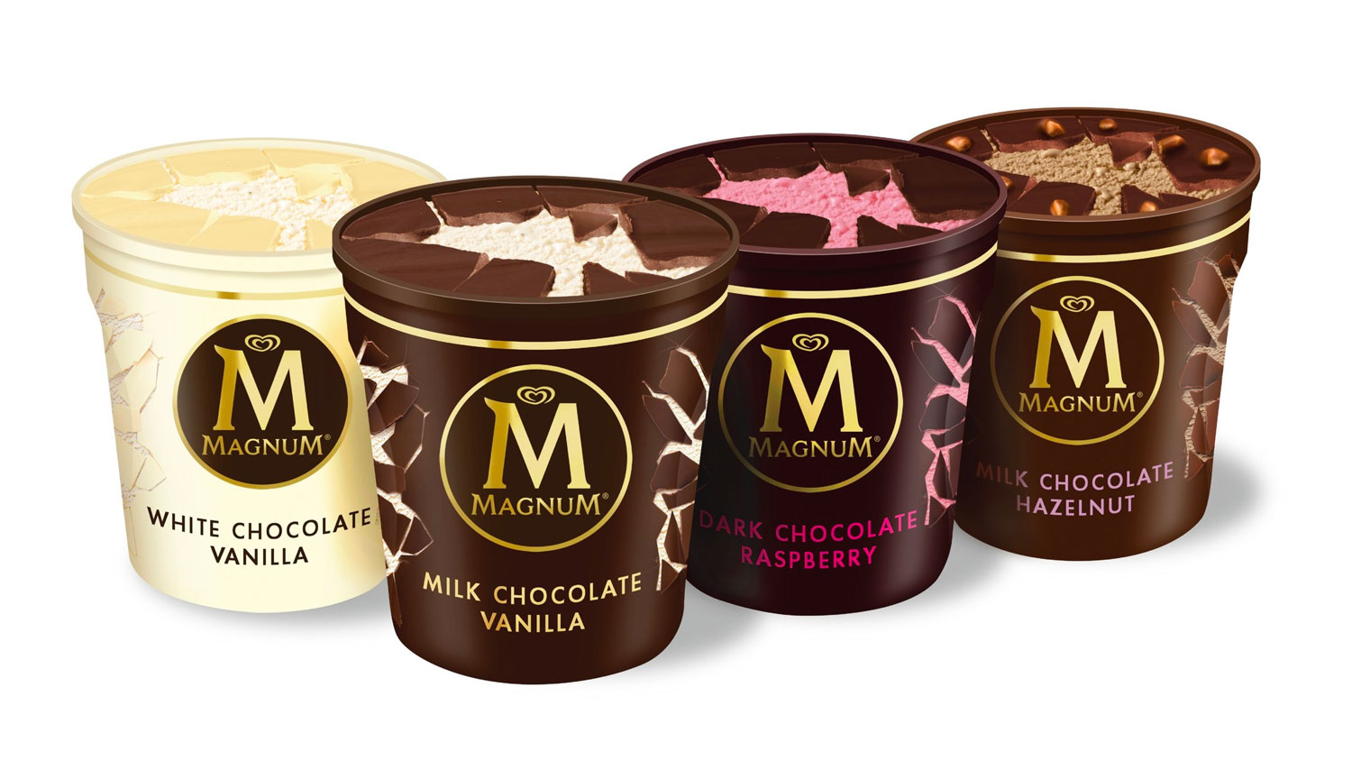
What experience are you offering, and will your packaging and format hold up to it? Are you a luxury ice cream, or a bag of premium vegetables with a zip lock? Whatever your proposition you need to live up to the experience and how that will unfold throughout the product lifecycle.
Your packaging needs to withstand the packaging process, a freezing process, distribution, shelf stacking, through to being picked up by a consumer and taken home. The journey doesn’t end there as the consumer will be storing you in their freezer (or tiny overfrozen letterbox freezer) to either use once, or take in and out.
We often see cardboard boxes that pop open, leaving rogue products lurking at the bottom of our freezers, stuck to the sides.
5. Trial, Trial & Trial Again
A frozen food product and packaging can go through a lot of wear and tear. It can also suffer temperature changes throughout production to ultimately being eaten by a consumer.
It is crucial to test this packaging for both on-shelf efficiency and packaging format stability and suitability.
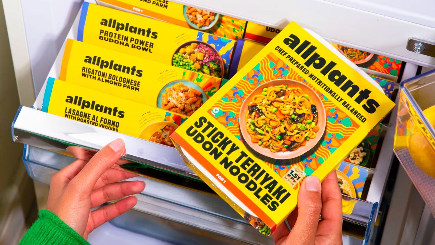
In the multifaceted landscape of frozen foods, packaging design plays a pivotal role in influencing consumer choice and shelf standout. By prioritizing the preservation of product integrity, clear communication, user-friendly design, brand consistency, and sustainability, frozen food brands can create packaging that protects their products and enhances the overall consumer experience.
A well-designed package is not just a container; it’s a silent brand ambassador that speaks to consumers from the frozen aisle to the dinner table.
Do you have a frozen food packaging design project on the horizon?
Get in touch to hear how we can help move your brand in frozen forwards.

Greatergood Brands®
Daniel Hinde is the Founder & Creative Director of Greatergood Brands. Daniel has over 20 years commercial experience building brands for global household names and disruptive challenger brands.
Sign up to our building better brands newsletter
Free insights for scaling brands


