Oddbox approached us to help them redesign their FMCG cooking sauce pouch packaging design – in order to gain their first retail listing.
The brand needed help in making their packaging design retail ready – communicating their unique value proposition, warranting a higher price point on shelf, and in extending their range and developing their brand in a suitable manner for retail success.
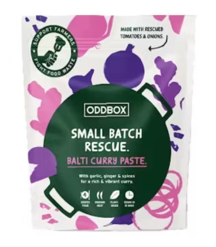
The Existing Design
We worked with Oddbox to help them understand where the current design was falling flat and how this would become a struggle in retail.
- SKU name – The product name was too long, unclear, and difficult to point to a particular category.
- Pricepoint – The pouch packaging design did not communicate why the product warranted a higher price than traditional jarred cooking sauces – around £2 more in price.
- Value Proposition – The packaging design did not communicate the unique value proposition and the value of the fresh ingredients which were being used.
- Brand Footprint – The brand footprint had been extended from the existing Oddbox brand identity – however this was a brand which was never built for retail. It was now operating in a different environment and the graphic silhouettes did not hint at fresh, vibrant food and ingredients.
- Brand Messaging – We understood that although Oddbox had a large DTC following, the same could not be said for a major retail environment. Consumers needed to know who Oddbox were, and what they did – or it added additional layers of complication and deciphering.
- Virtue Messaging – The product claims were reductive and did not elevate the product, its usage or its benefits.
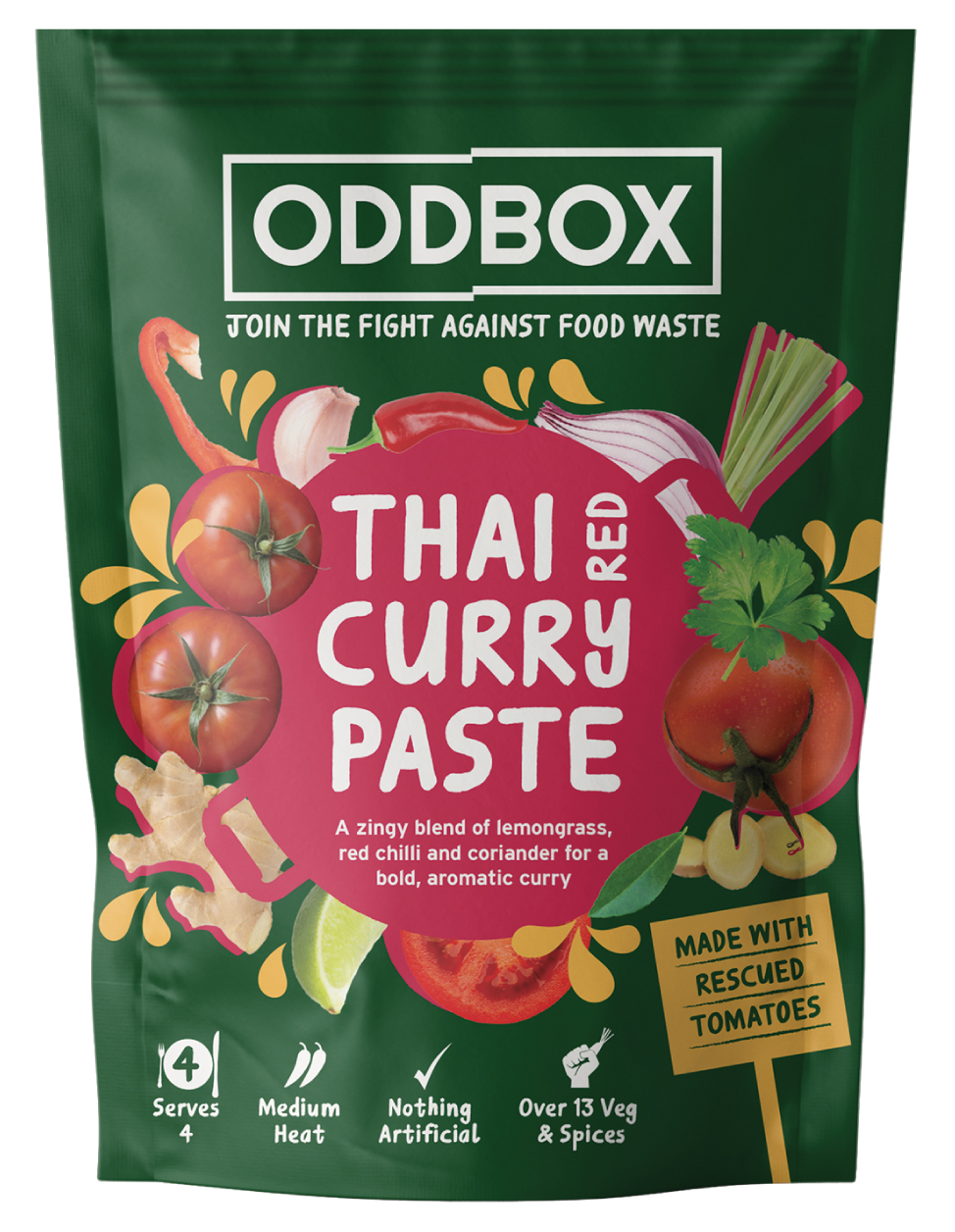
The New Design
We worked with the Oddbox team and their retail buyer to address their pouch packaging design concerns – and communicate quickly, and clearly on shelf.
Here’s what we did:
- SKU name – We updated the SKU name to be quick, and clear, and obvious which category this product should live in.
- Pricepoint – We warranted the higher price point on shelf by explaining to customers why our product was more expensive and the benefits they were gaining.
- Value Proposition – We worked relentlessly to get to the heart of what consumers needed in this category, we made it clear just how many fresh ingredients were in each pack as a key selling point “Over 13 Veg & Spices”, we demonstrated our food waste angle “MADE WITH RESCUED TOMATOES”, and we derisked the product for consumers sceptical of convenience sauces, “Nothing Artificial”.
- Brand Footprint – We continued to use the premium dark Green Oddbox – with a pop of colour for SKU differentiation. We continued to use some silhouette imagery, paired with bold natural ingredient imagery, highlighting the real and natural ingredients which were inside.
- Brand Messaging – “Join The Fight Against Food Waste” was added as a strapline locked up with the Oddbox brand – so consumers could have an immediate understanding of the Oddbox brand and our USP.
- Virtue Messaging – Virtue messaging was completely revised – with a focus on category competitor differentiation.
Following our pouch packaging redesign – Oddbox managed to secure their first retail listings and subsequent grocery listings.
You can view the full case study here.
Looking for a pouch packaging design agency?
Use the contact links below to hear more about our work with Oddbox, and how we can help your brand succeed in retail.

Sign up to our building better brands newsletter
Free insights for scaling brands