Multisensory packaging successfully draws on our senses of touch, sight, hearing, smell and taste.
When executed correctly these senses enable us to create memorable experiences – becoming synonymous with a brand and creating brand assets which can last a lifetime.
The opening sound and scent of a new Apple gadget, the refreshing crack of a drinks can, the sound of a champagne cork popping. These experiences have been designed as part of a multi-sensory approach to packaging excellence – Daniel Hinde (Greatergood Brands)
Previously, we wrote about how we can achieve a multisensory packaging design.
Here we take a look at some of our favourite multisensory packaging designs, and dig a little deeper as to how they have remained so popular with audiences.
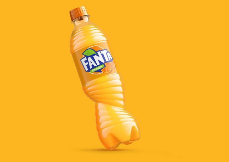
1. Fanta
Fanta redesigned their bottles in 2018 inspired by the squeezing of an orange. The new bottles created a valuable brand asset with their distinctive shape increasing shelf standout. The redesigned bottles are extremely tactile, playful and ergonomic whilst enhancing the brand experience.
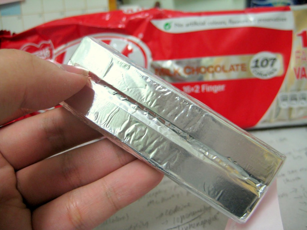
2. Kit Kat
A simple foil wrapper which can be ripped with a fingernail has provided Nestle’s Kit Kat with an invaluable brand asset for decades. The freshness wrapper adds additional sensory participation to the opening of the bar, creating a unique and memorable brand experience.
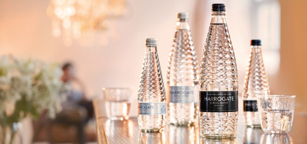
3. Harrogate Spring Water
Proving that innovation can still be driven in a saturated and competitive category like bottled waters – Harrogate’s beautiful structural glass bottles. The bottles have been formed with a diamond pattern which sparkles and pleads for participation. Shelf standout has been increased and visual table presence elevates this brand above the competition.
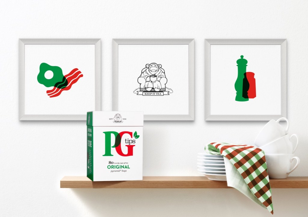
4. PG Tips
From the perfectly closing and clicking lid to the punch-through perforated opening – the PG tips packaging oozes participation and product freshness.
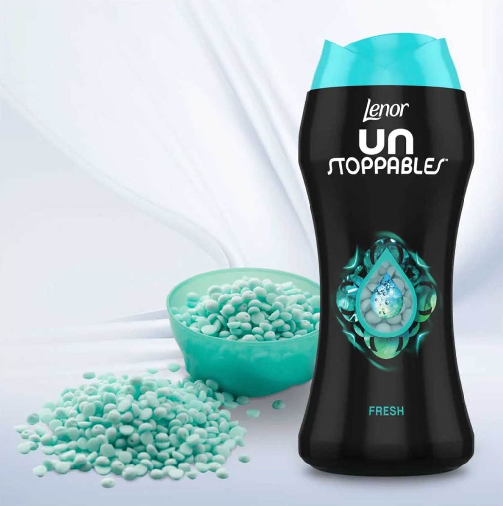
5. Lenor Unstoppables
When P&G’s Lenor Unstoppables launched into the laundry scents category the distinctive bottle gained shelf appeal grabbing attention. The top of the bottle also features a small hole for the product fragrance to escape from when given a gentle squeeze.
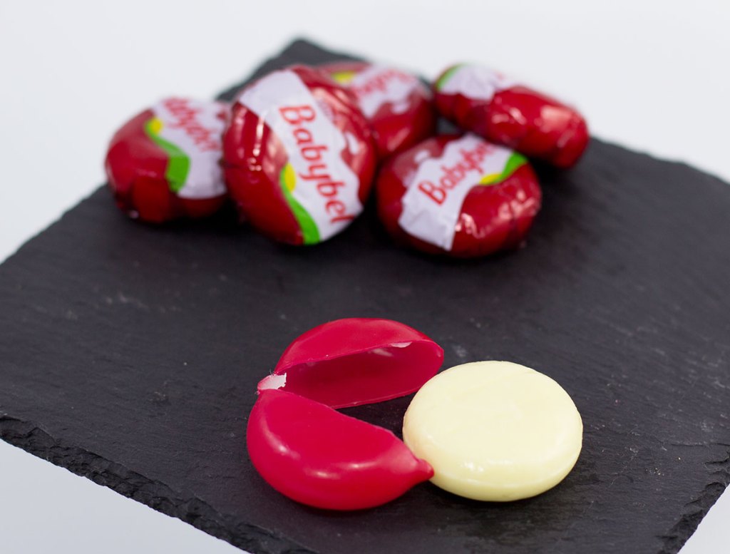
6. Babybel
Who can’t resist peeling a Babybel and playing with the wax-sealed wrapper afterwards? The traditional wax wrapper aids freshness increasing signals of quality and adding additional sensory touchpoint. For a single-serve product packaging, this creates a unique and memorable brand experience which has remained unchanged since its launch in 1977.
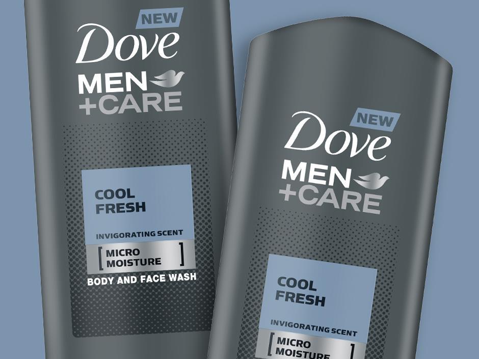
7. Dove Men + Care
Unilever’s Dove made the move into men’s beauty creating a complete new range of consumer products for the older male. The product range in elegant matte grey differentiates well on-shelf, featuring angular geometric edges and an easy to navigate product range.
8. Innocent
As part of a campaign raising money for Age UK, smoothie giant Innocent added knitted hats to their bottles. The knobbly additions increased awareness of the campaign and created a multisensory participation from consumers. The campaign also went viral with consumers sharing the hats in weird and wonderful ways.

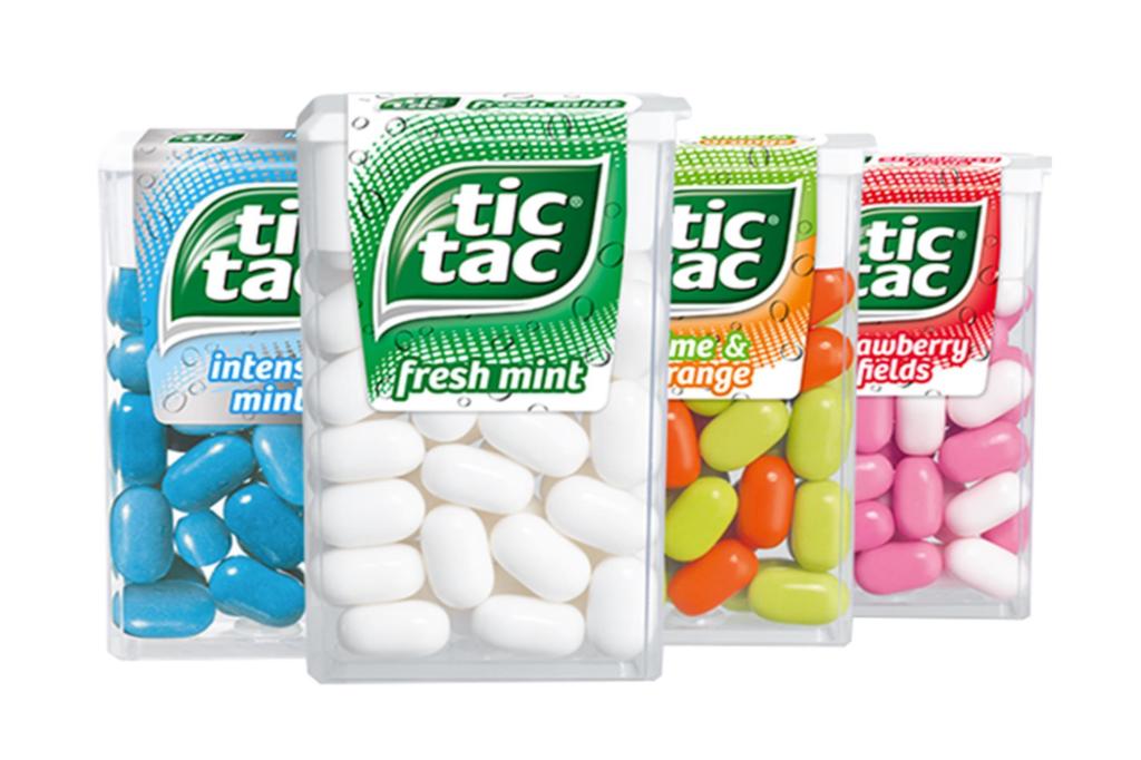
9. Tic Tac
There has always been something charming about Tic Tac’s packaging – elevating the product to that of something novel. The shaking sound, the click dispenser and the shareability make this one multisensory mint.
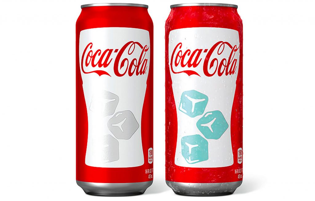
10. Coca Cola
Coca Cola’s hot and cold ice cube colouring is a great example of multisensory packaging design with the use of heat-activated thermochromic inks. When the cans are chilled the ice cube colouring appears, when they are warmer or room temperature – the ice cubes disappear.
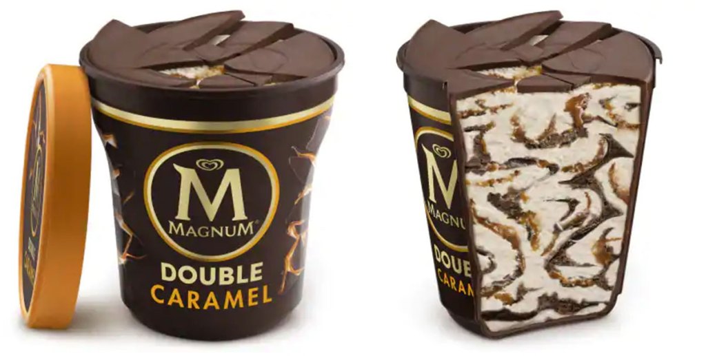
11. Magnum
Magnum created chocolate encased tubs of their classic ice cream – encouraging consumers to crack the chocolate by squeezing the pot and breaking through the top. This unique harmony between packaging and product has created a brand experience and serving ritual which consumers love.
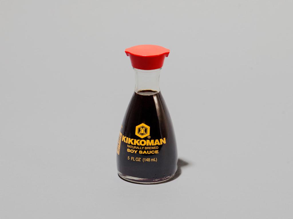
12. Kikkoman
Kikkoman Soy Sauce bottles are an exemplary example of iconic and multisensory packaging design. The bottle has a wide heavy base relative to it’s delicate neck making it solid and secure on a table. The vibrant spout dispenses just a dash of soy without dripping or dribbling down the neck. The bottle fits perfectly in the palm of the hand becoming a joy to use.
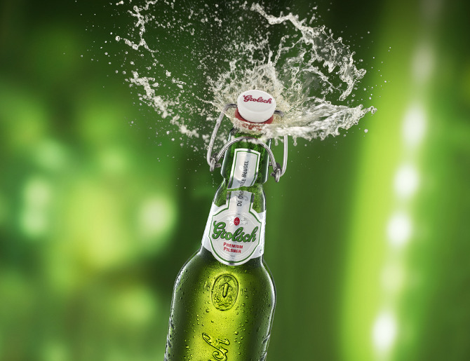
13. Grolsch
Grolsch’s thick green bottles together with swing-lid bottle tops signal some serious refreshment. The branded lids became somewhat of a pop cult icon and are still sold online to this day. The alluring opening added extra layers of interaction and created a unique cork popping sound and drinking experience.
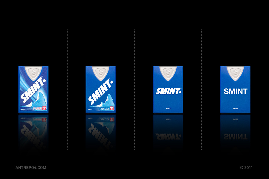
14. Smint
Another multisensory mint this time from Smint. The iconic Smint dispenser has been around and remained relatively unchanged since its launch in 1994.
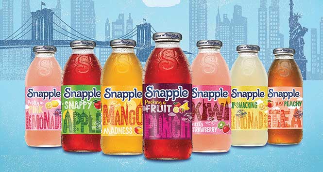
15. Snapple
Snapple spent a considerable amount of time sound engineering the refreshing ‘pop’ from opening a bottle all thanks to the metal cap lid. The quirky and refreshing sound has become so synonymous with the brand that they even kept the metal caps when moving over to plastic bottles.
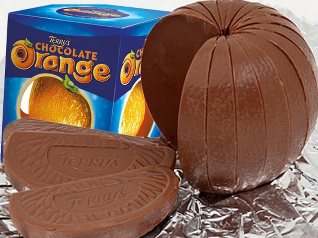
16. Terry’s Chocolate Orange
Terry’s Chocolate Orange is an inherently fun and shareable classic. From Dawn French educating us “Don’t Tap It Whack It” to the almost peel-able chunks, this is one brand which has multisensory charm in abundance.
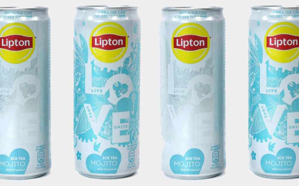
17. Lipton
A bolder and more intricate use of heat sensitive thermochromic inks from Lipton. The can design appears when the drink is chilled to perfection. However, disappears as they adjust to room temperature or heat from touch.
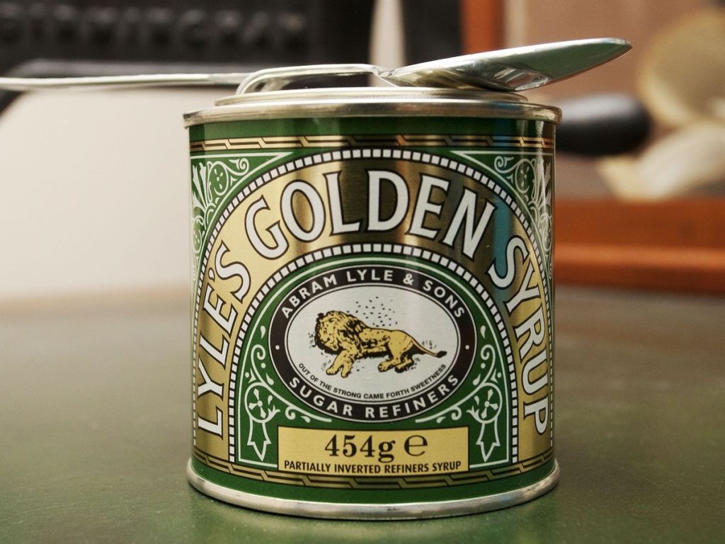
18. Lyles Golden Syrup
The solid paint can inspired syrup barrel screams nostalgia – with the lid opening requiring the end of a spoon or utensil to flip open. As the packaging ages and more syrup gets stuck around the lid it remains easy and enjoyable to open.
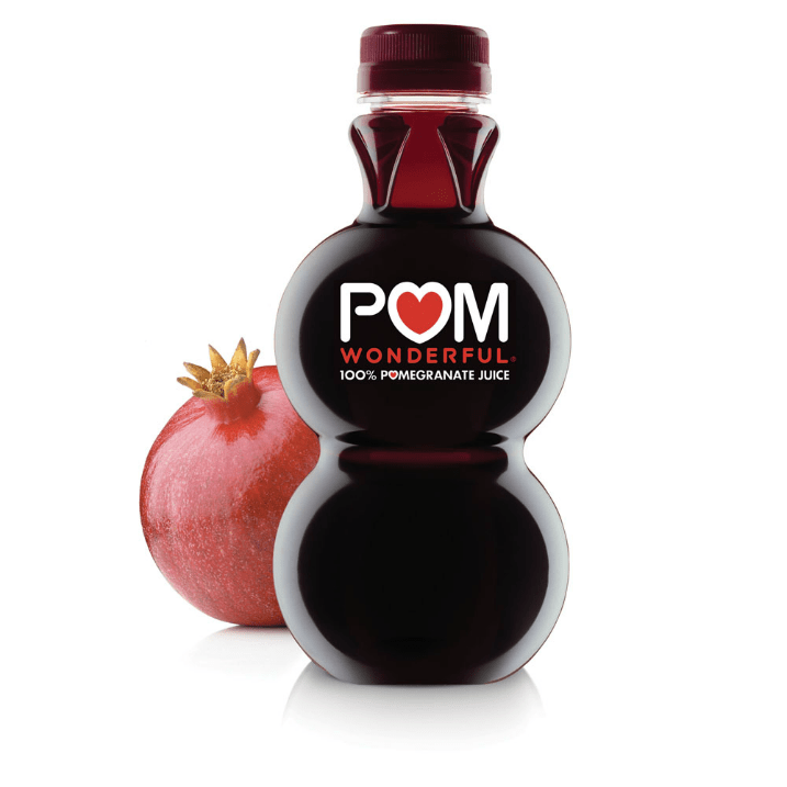
19. Pom Wonderful
The stacked orb Pom juice bottle has incredible visual impact and shelf standout in a category which often sees little innovation in terms of structural packaging design. The bottle is not only beautiful but is a joy to hold increasing sensory value visually and ergonomically.
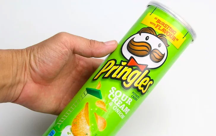
20. Pringles
A great example of packaging sound engineering from Pringles with the use of the classic Pringles lid. The distinctive ‘pop’ has become an invaluable brand asset inspiring the slogan ‘Once you pop you just can’t stop’.
Do you have a packaging design project in mind?
Get in touch to hear how we’ve worked with clients big and small on packaging design for over 20 years.

Sign up to our building better brands newsletter
Free insights for scaling brands