Firebites
Snack Packaging Design
Snack branding and packaging design for a new range of cult hot crisps.
Type Of Client
Food & Beverage
Type Of Work
Brand Identity Packaging Design
The Brief
We were approached by Firebites to create a new snack brand and packaging range for their new range of hot crisps.
The Work
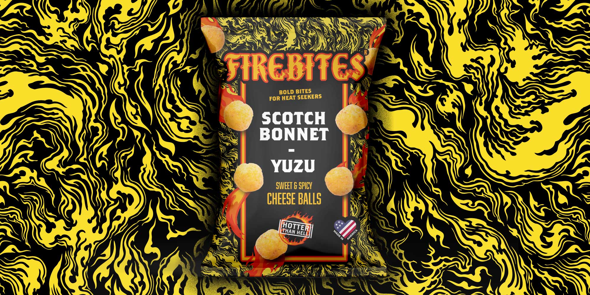
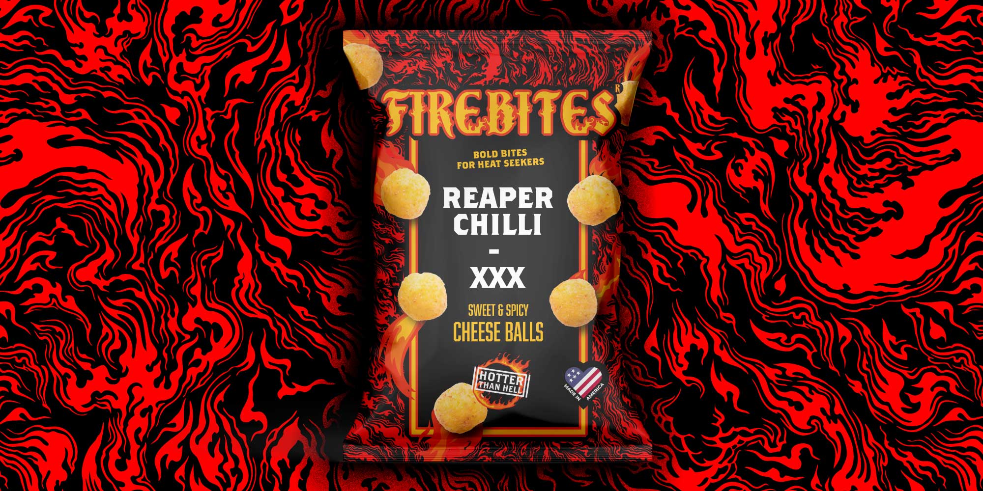
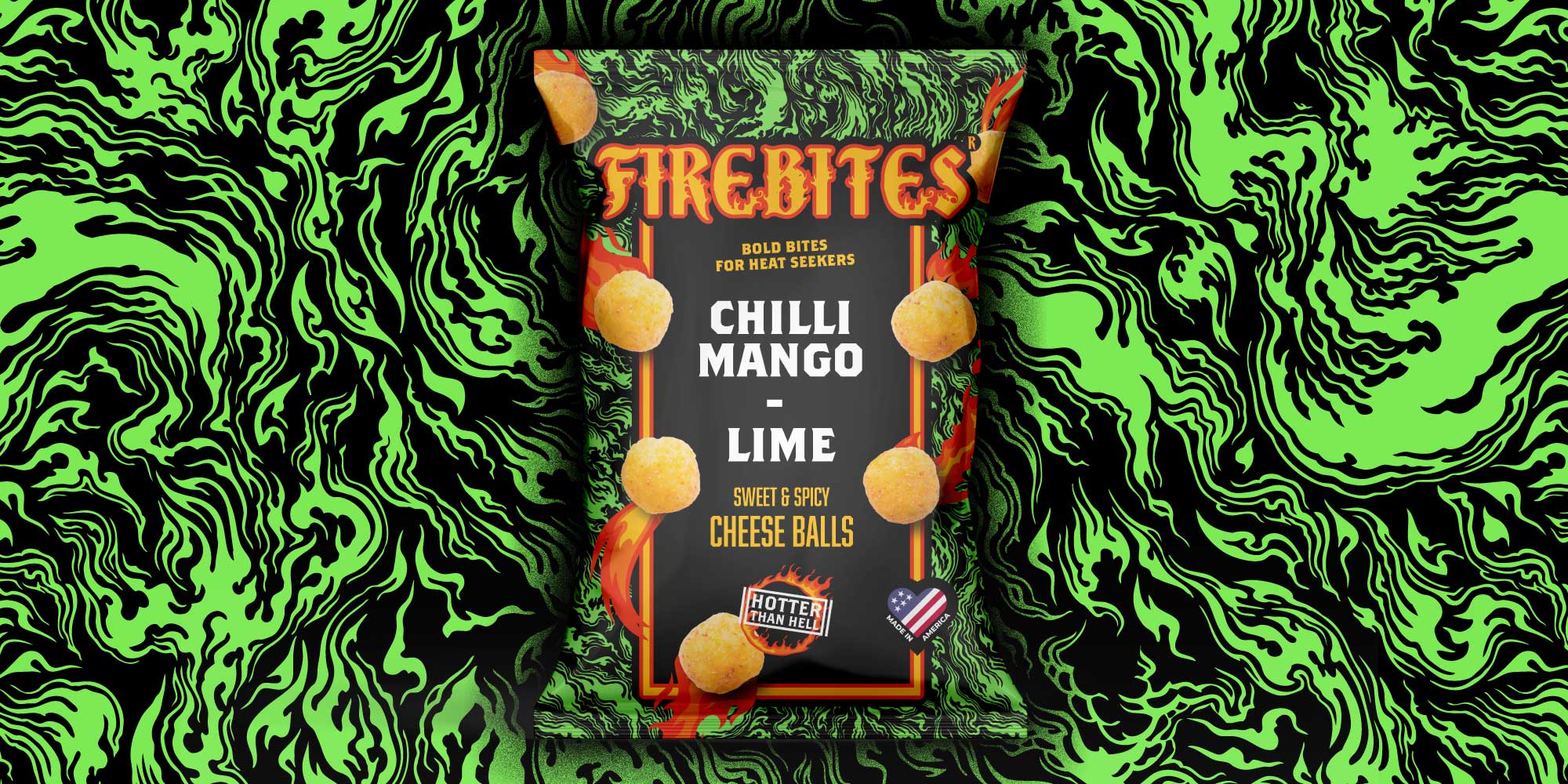
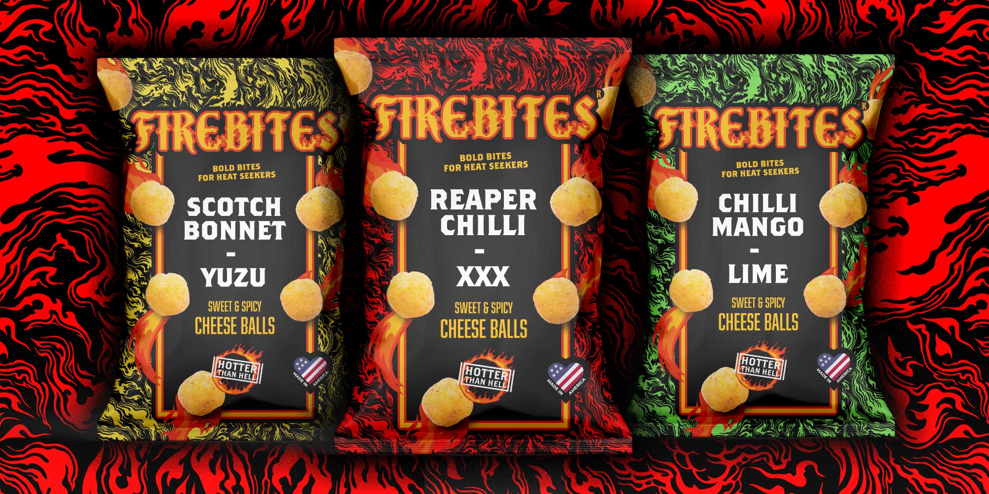
From the off we wanted to steer clear of typical FMCG hot crisp imagery and create a range with a cult craft feel which we could position at a higher price point to the other category players.
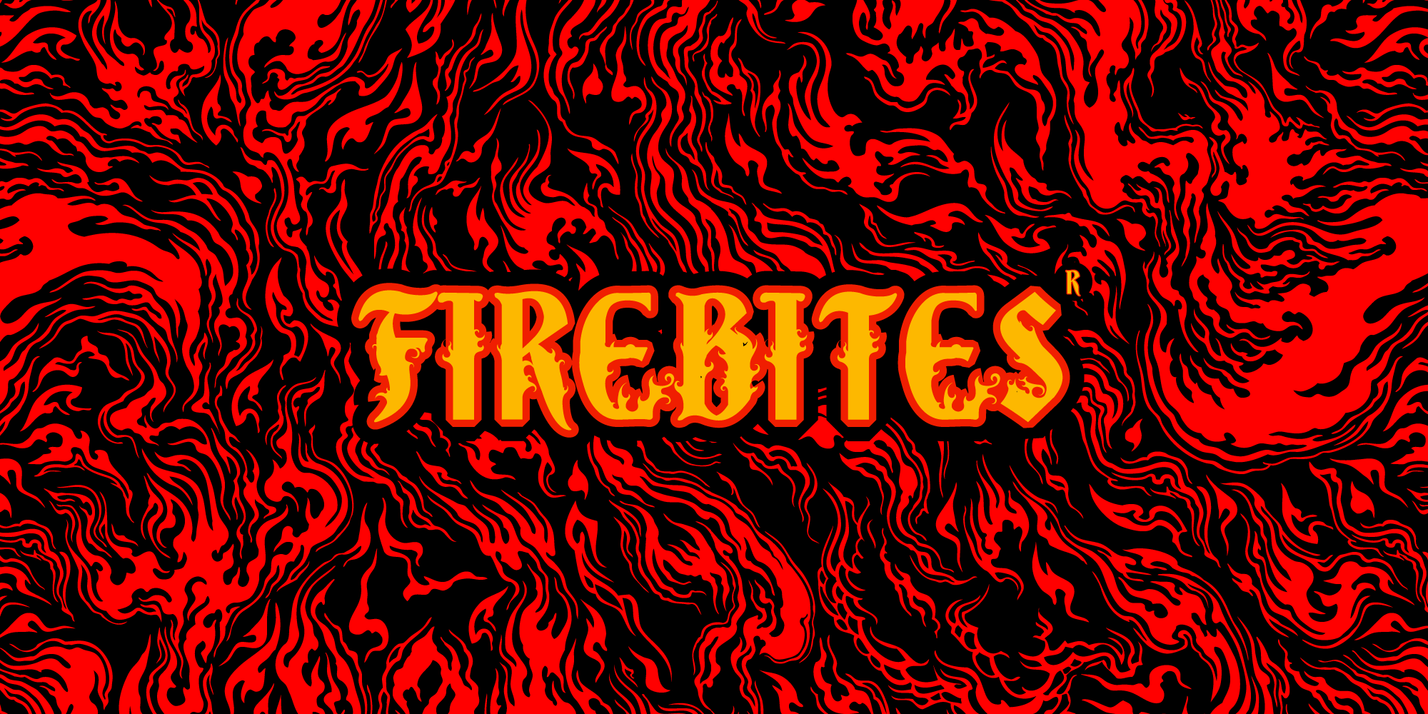
We created a bespoke logotype using traditional woodcut techniques to add layers of interest and sell the heat-led proposition.
This was paired with a suite of seamless flame patterns that were flooded across packets in bold SKU colours for shelf standout, and differentiation against other category household names.
The Outcome
The result is a brand that has immediate shelf standout, encourages repeat purchases and multiple buys, and makes the heat proposition clear to consumers – in a more premium approach to traditional hot snacks.
How We Helped
Brand Identity Development
Packaging Design
Want to hear more about how we worked with Firebites or have a snack packaging design project in mind?
Get in touch or enter your email below…

