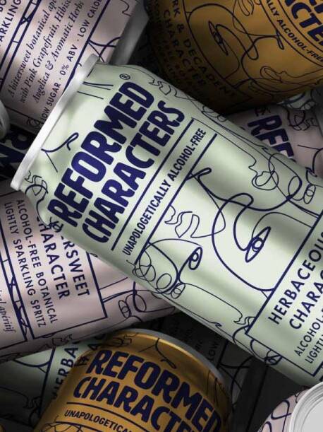
We have written in previous articles about the importance of first impressions within packaging design. From print finishes to multi-sensory design and ensuring a thorough packaging brief.
Consumers on average take a mere 5 seconds in making a purchasing decision whilst shopping.
First impressions count. In those 5 seconds, your product needs to communicate what it is, who it is from, what its benefits are – and why it’s better than the brand next to it.

Here we take a look at 15 Tips for Effective Front of Packaging Messaging...
- Where does your branding sit?
Do your customers need to notice your brandmark immediately? Or the product title, and the brand secondary? This will determine where you see your brandmark sitting on pack. Is it at the top and central, or bottom with product name taking dominance? Is your brand loud and proud, or perhaps more toned down (or even featured on the reverse). - Establish your messaging hierarchy
What is the messaging hierarchy for the product? What should we be reading first, second, third? Where do your calls to action live? - And make sure people can read it
At the very least your product title needs to be readable from a metre away, how about your product description, USP’s, the product serving, the weight? Work out what you can actually see without picking the packaging up (must read, nice to read, pick up to read). Imagine a shopping trolley is between you and your product. Does it read and communicate well without being picked up? - Get to the point
Is your copy straight to the point? Keep it short and sweet but be consistent with your tone of voice. - Is your messaging foolproof?
You are not the customer. You have an expertise in your product and market, and as such have a completely single-minded view of it. Would an average customer know how to use your product, would they even know what it is? Inform the customer – nobody likes to gamble with their hard-earned cash. - Establish your tone of voice
Is your front of pack direct but true to your tone of voice? Do you need to make an emotional connection with the customer? If so, how do you do that in a coherent and straight forward fashion? - Do you have a good balance of icons and text?
The use of icons can help to reduce lumps of text which simply will not get read. Icons are also a great opportunity for shouting your product benefits. - Virtue signalling and USP’s
Are you shouting your USP’s on front of pack? This is your opportunity to gain the upper hand on your competition and really sell your product. Have fun with this messaging, be confident and make it ownable. - Get your product variants / SKU messaging right
Keep longevity in mind. You may only begin with a small number of products or even a single product, however as that grows your communication requirements will grow. Products need their own unique titles, colour and ways of differentiating. On-shelf these should stand next to each other and communicate quickly and clearly, what the products are, and what the difference is. - Do you have product windows?
Is your product visible? How does this affect front of pack communication? Any product windows should be showcasing the best element of the product and not leaving anything to chance. An ill-thought-through product window could just show air when the product is manufactured and filled. - How much surface area is going to be visible?
When lined up on shelf, how much central surface area remains visible? Bottles, cans, jars and pouches can have a deceptive amount of surface area. Messaging can be obscured when lined up on shelf and held in an SRP.
- Consider the retail environment
You need to consider the environment and way in which your products will be displayed. Will you be shipping and displaying your products in a shelf-ready packaging? Be aware that there will be an edge in front of your products where nothing will be visible at all. - Openings & Closings
Is it obvious where and how your product opens? If it is resealable, is that communicated well? Do elements of your messaging get removed upon opening / tearing open? - Are you being honest and transparent?
Is it clear how big the product is and what is inside the box? Be upfront about any misgivings. Don’t leave a consumer feeling short-changed post-purchase. - Legal requirements
Are you aware of your legal obligations for front of pack? Dependent on your product this can include weight and associated symbols, servings and claims. It is illegal to mislead a consumer by deliberately inappropriate messaging.
With a short window of time to engage a customer and a great deal of information to communicate – it’s a good idea to sit down and plan packaging messaging and content carefully.
Planning will save time and expensive mistakes further down the line.
Do you have a packaging design project in mind?
Do you have a packaging design project in mind? Get in touch to hear how we work with clients from global brands to disruptive challengers and startups.
Get in touch

Greatergood Brands®
Daniel Hinde is the Founder & Creative Director of Greatergood Brands. Daniel has over 20 years commercial experience building brands for global household names and disruptive challenger brands.
Sign up to our building better brands newsletter
Free insights for scaling brands


