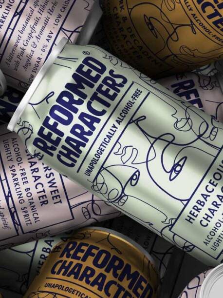
In developing a packaging design brief, the fundamentals can be distilled down to Simplicity, Clarity & Communication, Shelf Appeal, and Longevity/Versatility.
We can create packaging which looks great on shelf and connects with an audience – but how can we continue to stimulate and create a multisensory experience which resonates upon contact and post-purchase.
The opening sound and scent of a new Apple gadget, the refreshing crack of a drinks can, the sound of a champagne cork popping. These experiences have been designed as part of a multi-sensory approach to packaging excellence.
Here we take a look at several ways you can add a multi-sensory design approach to your packaging project through the use of:
- Design
- Shape & Format
- Texture
- Sound
- Smell
Design
- Thermochromic hot and cold inks
Long favoured by the drinks industry – thermochromic inks change upon cold or heat making them great for showing when a drink is chilled to perfection. They also add an interactive element to designs as ink can ‘disappear’ with the subtle heat from touch. - Hot and cold foils
(also see: Food Packaging Design Finishes For Retail Success)
- Embossing and debossing
(also see: Food Packaging Design Finishes For Retail Success)
- UV Gloss and highlights
(also see: Food Packaging Design Finishes For Retail Success)
Shape & Format
- Opening & Closing mechanisms
Opening and closing mechanisms involve direct participation in the packaged good and can be approached in a breadth of memorable ways. Just think of the addictive nature of popping a Pringles can, and how this becomes part of the brand experience (once you pop you just can’t stop). - Opening seals
Likewise, opening devices can convey a sense of freshness and quality – a tactic which has worked for the tea and coffee market for some time. Think – coffee valves on bags, ring pull tin openers on coffee jars – or the distinctive wrapper of a Kit Kat. - Shape, Curves & Grips (Ergonomics)
Adding curves to structural packaging can make it feel more delicate and human – whereas solid lines can imply strength and robustness. The use of unique curves and grips can become a memorable and lucrative brand asset. From fragrance to sauce bottles – brands fight to own the most unique, functional shapes which push the limits of design. - Physical weight
The physical weight of a packaged object can also give implications of its quality and add to cues of a premium product. - Before/After opening
On opening does the packaging become interactive? This happens often with children’s toy packaging opening up and becoming something the child can play with or a scene to be used. Likewise, food packaging can often open up to form a tray for eating on the go.
Texture
- Textured and hammered papers
There are countless options to choose from when selecting paper stocks from soft touch, to satin and gloss – all textures have different benefits and associations. - Diecutting
(also see: Food Packaging Design Finishes For Retail Success) - Embossing and debossing
(also see: Food Packaging Design Finishes For Retail Success)
Sound
- Opening seals
We mentioned the benefits of opening seals earlier on – specifically with sound how can the material you’re using enhance the opening experience? - Opening & Closing mechanisms
Does your product make a sound when it opens and closes? Could this be enhanced to sound louder, or become softer to compliment your product?
Smell
- Scents as adhesives
In products where scent is nearly completely lost (frozen foods etc) – manufacturers have managed to replicate scents contained in packaging adhesives, releasing a scent upon opening. - Scents hidden within packaging
An alternate approach sees scents encapsulated in places like the lids of ice cream tubs, and in the neck of drinks bottles.
Although multi-sensory packaging design is still in its infancy, some of our favourite and most known packaging designs of all time have employed a sensory approach to their advantage. With the growth of new technologies in printing, and the advancement of AR and VR – this is definitely a unique space to watch unfold.
Do you have a packaging design project in mind?
Get in touch to hear how we’ve worked with hundreds of packaging design clients across a wide range of categories and markets.
Get in touch

Greatergood Brands®
Daniel Hinde is the Founder & Creative Director of Greatergood Brands. Daniel has over 20 years commercial experience building brands for global household names and disruptive challenger brands.
Sign up to our building better brands newsletter
Free insights for scaling brands

