


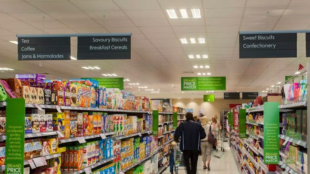
As an FMCG or CPG brand, your product’s packaging design is crucial to its success on the retail shelf. Shelf-ready packaging (SRP) plays a particularly important role, as it is the packaging that retailers use to display your products on the shelf. Effective SRP packaging design can help your products stand out from competitors, catch consumers’ attention, deliver additional brand messaging and claims – and ultimately drive sales.
Your SRP is an additional chance to convert a packaging pickup to a product purchase – make sure you use it!
Here are 8 tips for Designing Effective SRP Packaging Design for FMCG & CPG Brands:
1. Consider the retail environment
Before designing your SRP, take into account the retail environment where your product will be displayed. Consider any restrictions or guidelines set by the retailer before making expensive mistakes.
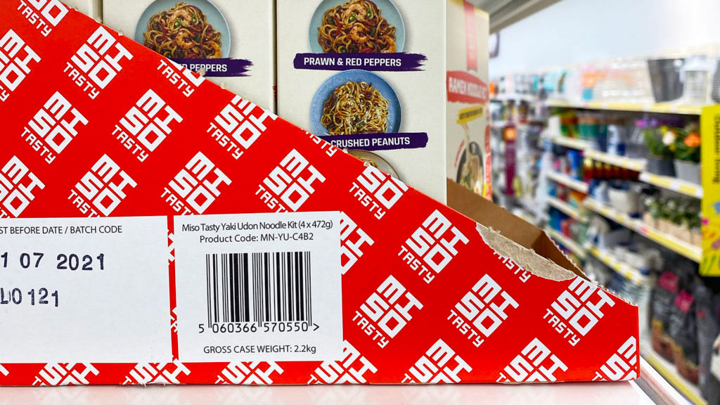
2. Go bold with colour
SRP printing can be as expensive as your product packaging – most brands may choose to only print a single colour to keep costs down. Use a bold colour which is synonymous with your brand and will enhance your shelf standout.
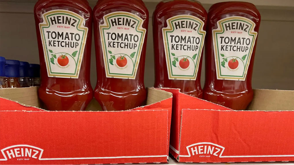
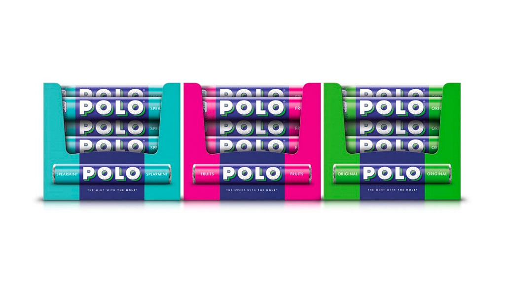
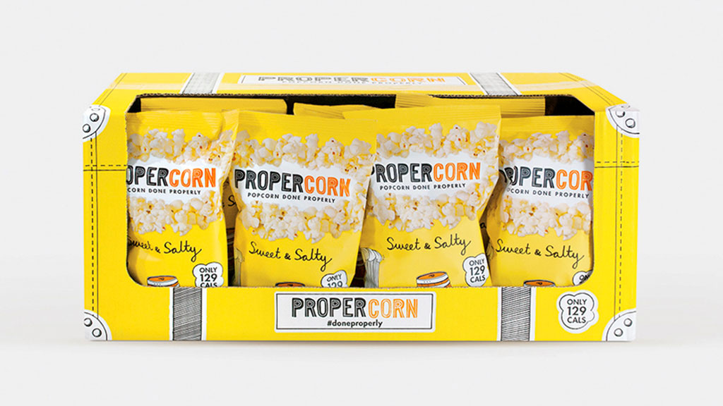
3. Consider shelf blocking
Shelf blocking does what it says on the tin – creating entire blocks with a focus on your brand, this could be through brand assets (like the below example from Polo), or from using solid colours (like the above from Heinz).
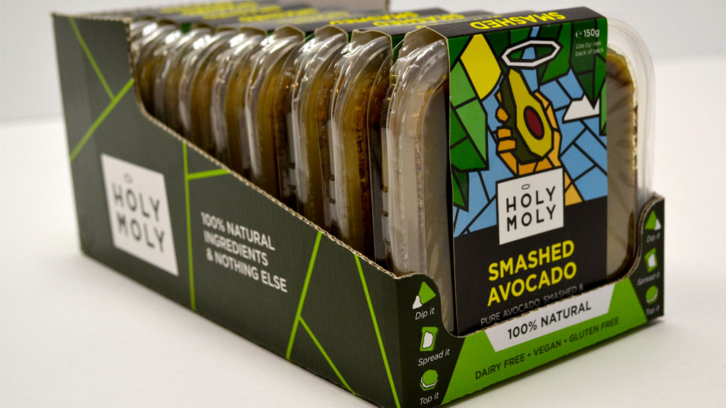
4. Make use of messaging
What important pieces of messaging did you not manage to get onto your main packaging design? What virtue claims and USPs will set you apart from the category competition?
5. Make it easy to open
SRP packaging should be easy to open, both for retailers stocking shelves and for consumers purchasing products in bulk. Use perforations, tear strips, or other easy-opening mechanisms to make your SRP user-friendly. Consider getting mockups printed before doing a full large-volume run to make sure your format and cutter guide actually work properly.

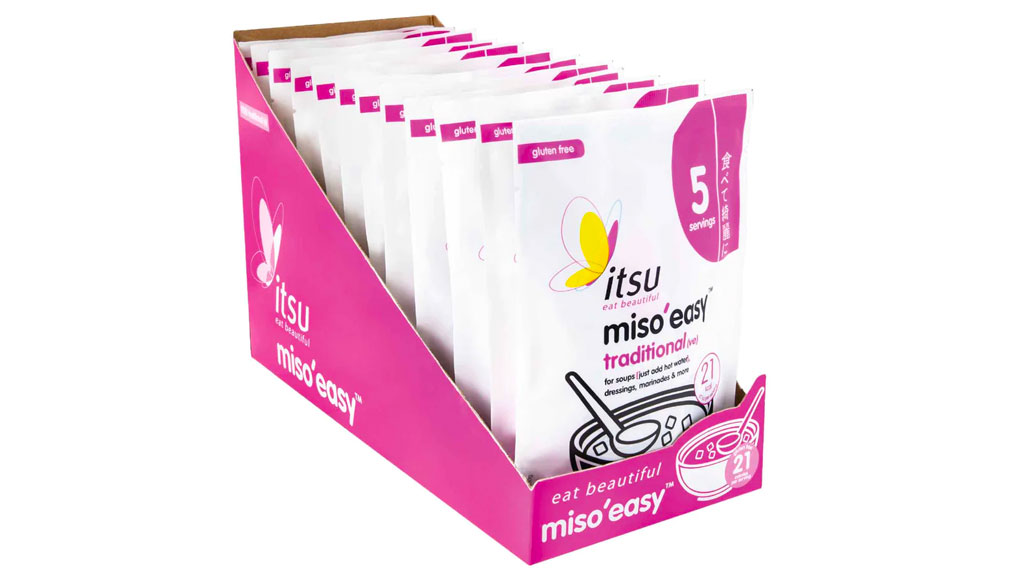
6. Make sure it aids recognition (not just for consumers)
Brand recognition on your SRP isn’t just for consumers – it makes it easier for retailers to pick at the back of store when filling shelves. Your warehouse/logistics/3PL is also likely to have hundreds (if not thousands) of pallets of other brand stock, when picking stock they need to be able to quickly and easily identify your brand to ensure mistakes aren’t made.
7. Keep it simple
While it’s important to create an eye-catching design, keep in mind that cluttered or overly complex designs can be confusing to consumers when looking at a category full of brands already trying to grab their attention. Keep your SRP design simple and focused on key messaging, or brand recognition.
8. Think of the environment
Customers will be stood in a physical store at a distance from the shelf – is your messaging readable from a distance? When several feet away, how much does your SRP stand out in comparison to other brands?
By following these tips, we hope you can create an effective SRP packaging design that helps your products stand out on the retail shelf and drive sales for your FMCG or CPG brand.
Need help with an SRP packaging design or looking to make the most of your existing format? Get in touch to find out how we work with FMCG clients and can help your brand gain standout on shelf, and off.
Sign up to our newsletter for free insights on all things brand, consumer, FMCG & CPG.
More Insights
 FMCG & CPG Marketing Strategy: Free Template
- How To Build A FMCG Brand
- Why Brand Guidelines Are Important – 10 Reasons
- Frozen Food Packaging Design – 5 Key Considerations
- Food Packaging Design – 10 Tips On Labelling Compliance
- FMCG Digital Marketing Strategies on a Shoestring – 8 Ideas
- 7 Tips for Product SKU Naming for FMCG Food & Drink Brands
- Effective Experiential Marketing Activations for FMCG & CPG Consumer Brands – 10 Tips
- Brand Storytelling – 15 Tips for FMCG Brand Storytelling
- Successful Packaging design in DTC & E-Commerce – 8 Tips
- Food Packaging Design – Designing for Limited Editions
- Food Packaging Design Fundamentals – 5 Things You Must Get Right


Leave a Reply