


The Project
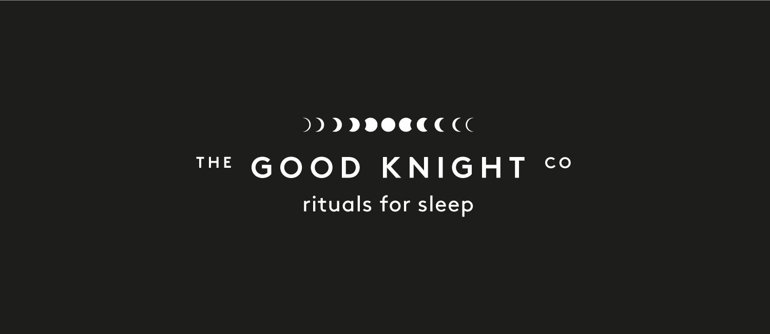
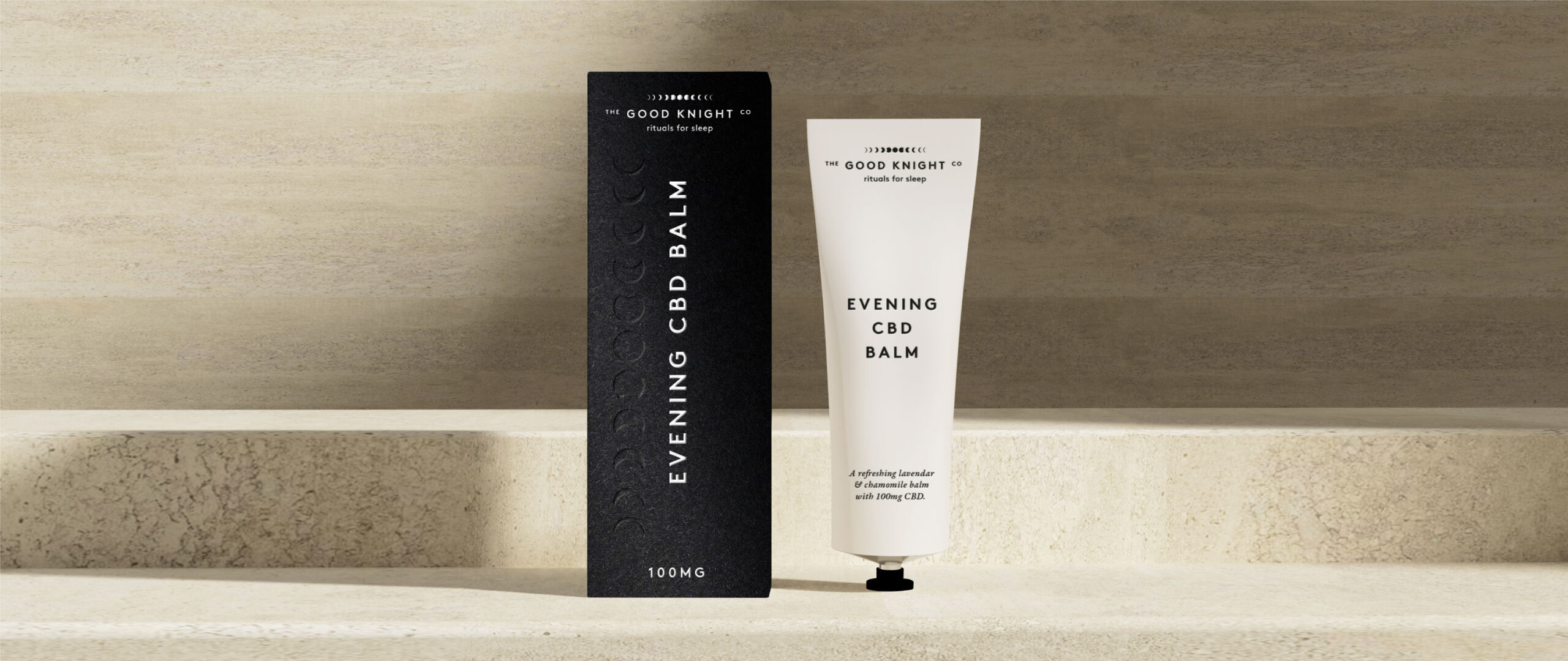
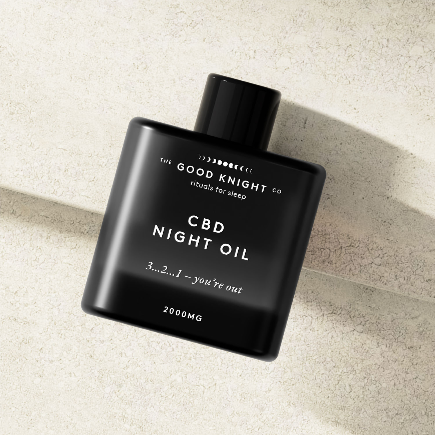
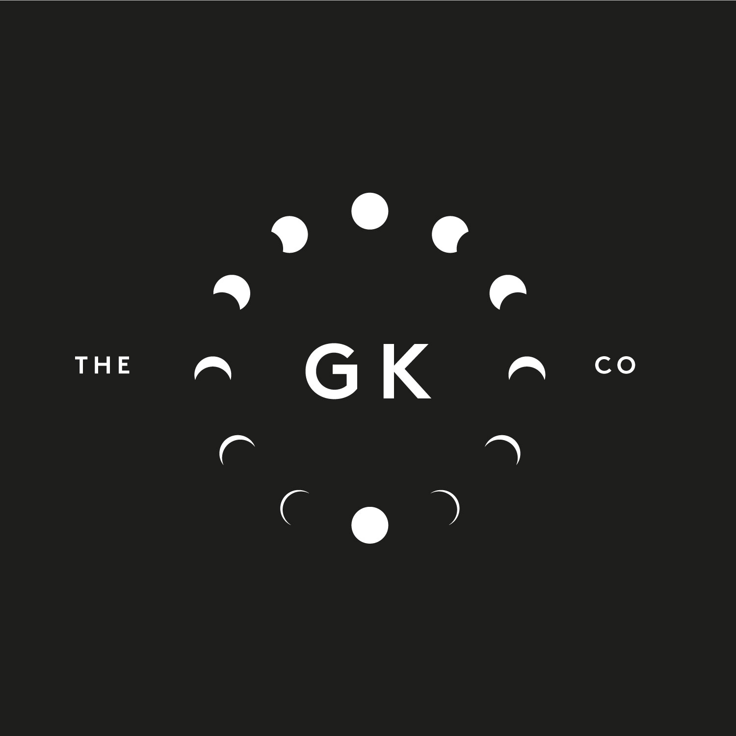
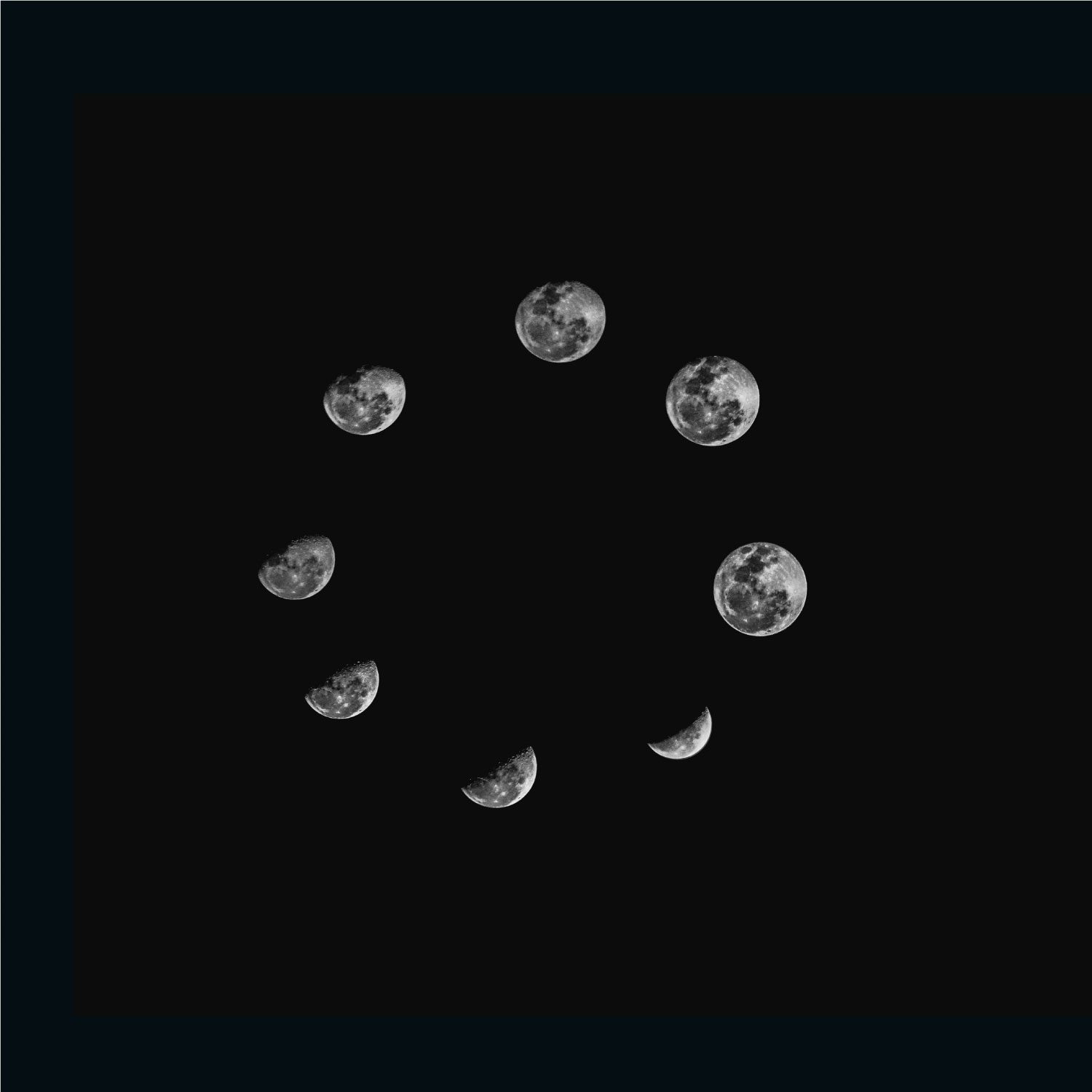
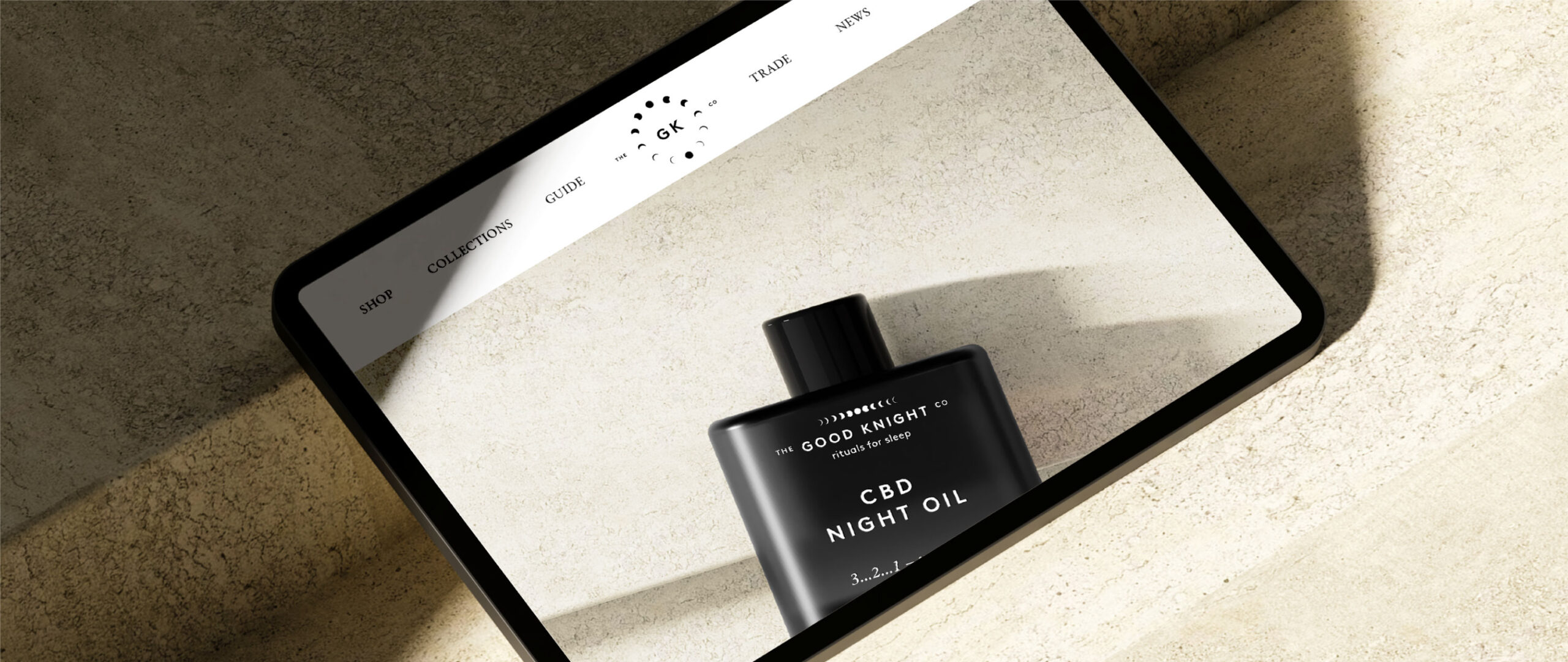
The brief was to create an aspirational lifestyle brand that consumers would want to proudly display on bedside tables. We created a sleek & chic Black and White brand identity and design system making use of lunar phases as a key brand asset.
Use of monochrome and moon phases made the proposition immediately clear as a sleep product with functional benefit. This was paired with clean and contemporary confident typography and understated luxury packaging treatments across SKU’s.
How we worked with The Good Knight Co
Want to hear more about how we worked with The Good Knight Co or have a consumer packaging design project in mind?
Everyone has commented on the brand and packaging and how absolutely spot on it is – great work!
Charlie
The Good Knight Co

Stir It Up

Union Coffee

Fruitful

Gro Gro®
EIT Food
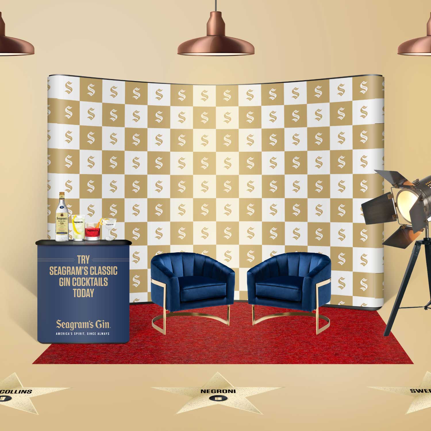
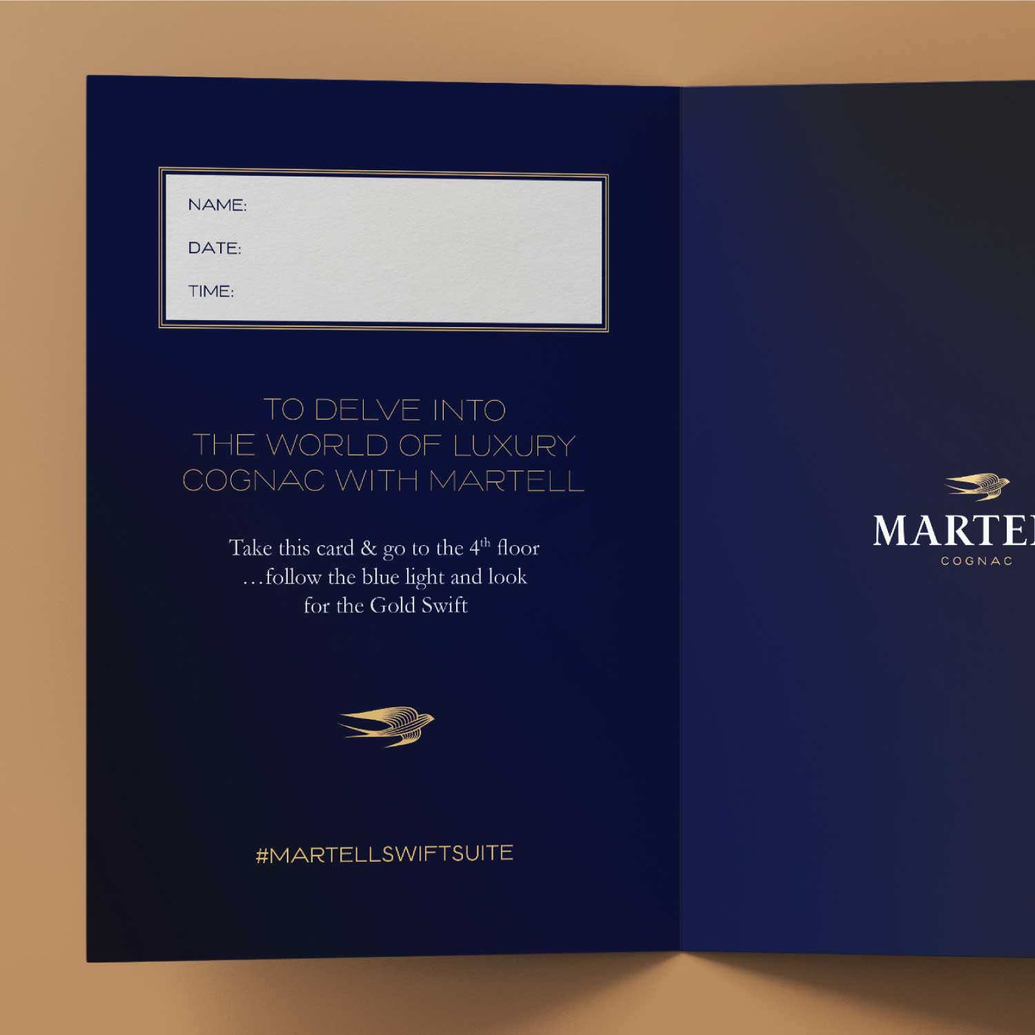
Seagram’s Gin
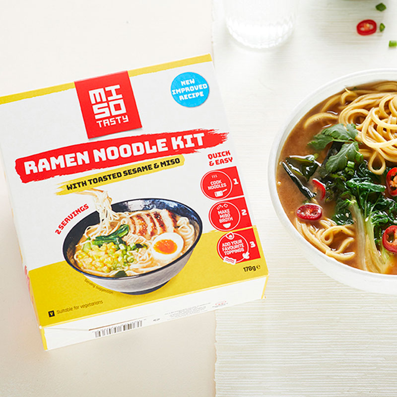
Miso Tasty
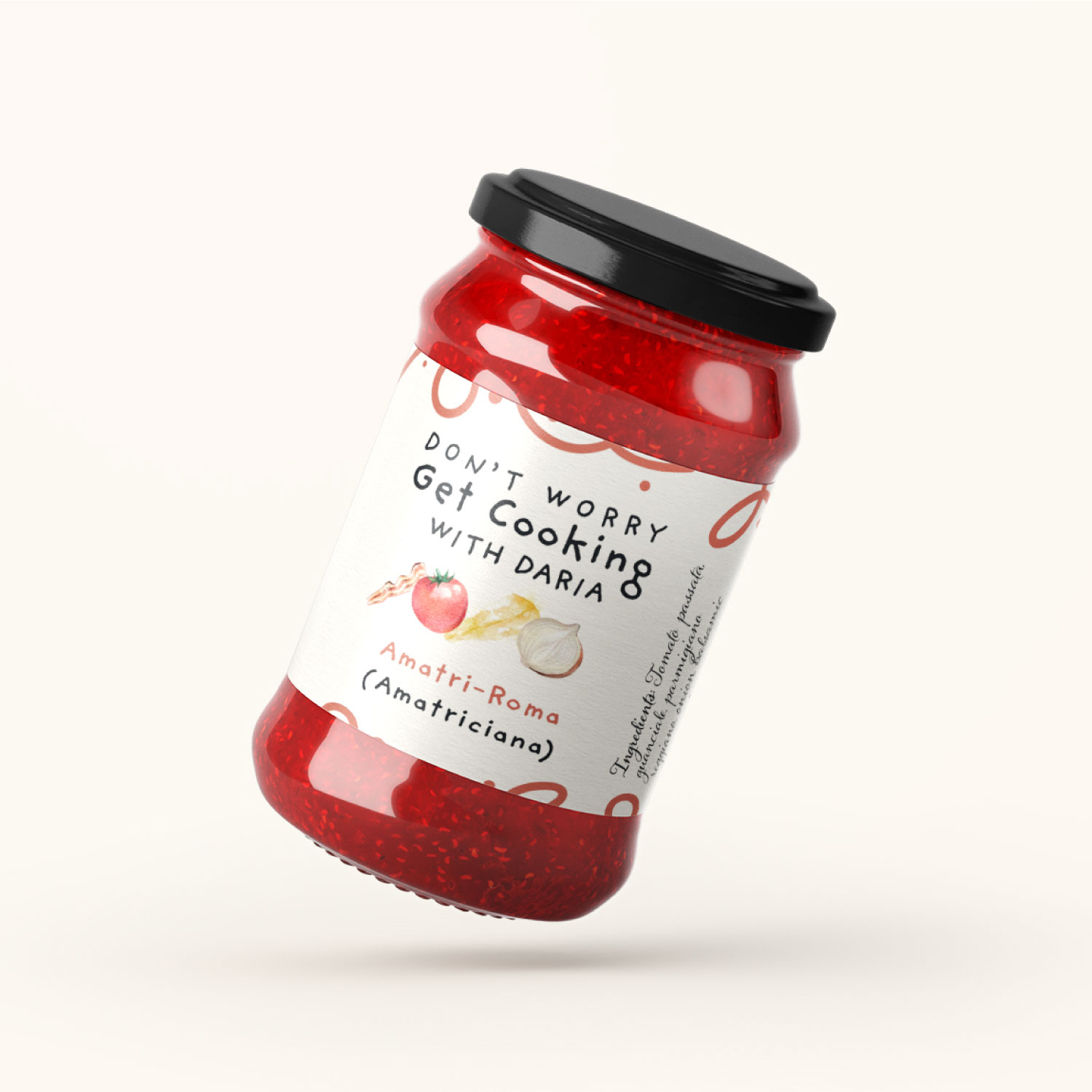
Don’t Worry Get Cooking

Natural Ketosis
FMCG Food To Go

The Deaf & Hearing Ensemble

Firebites

Snact
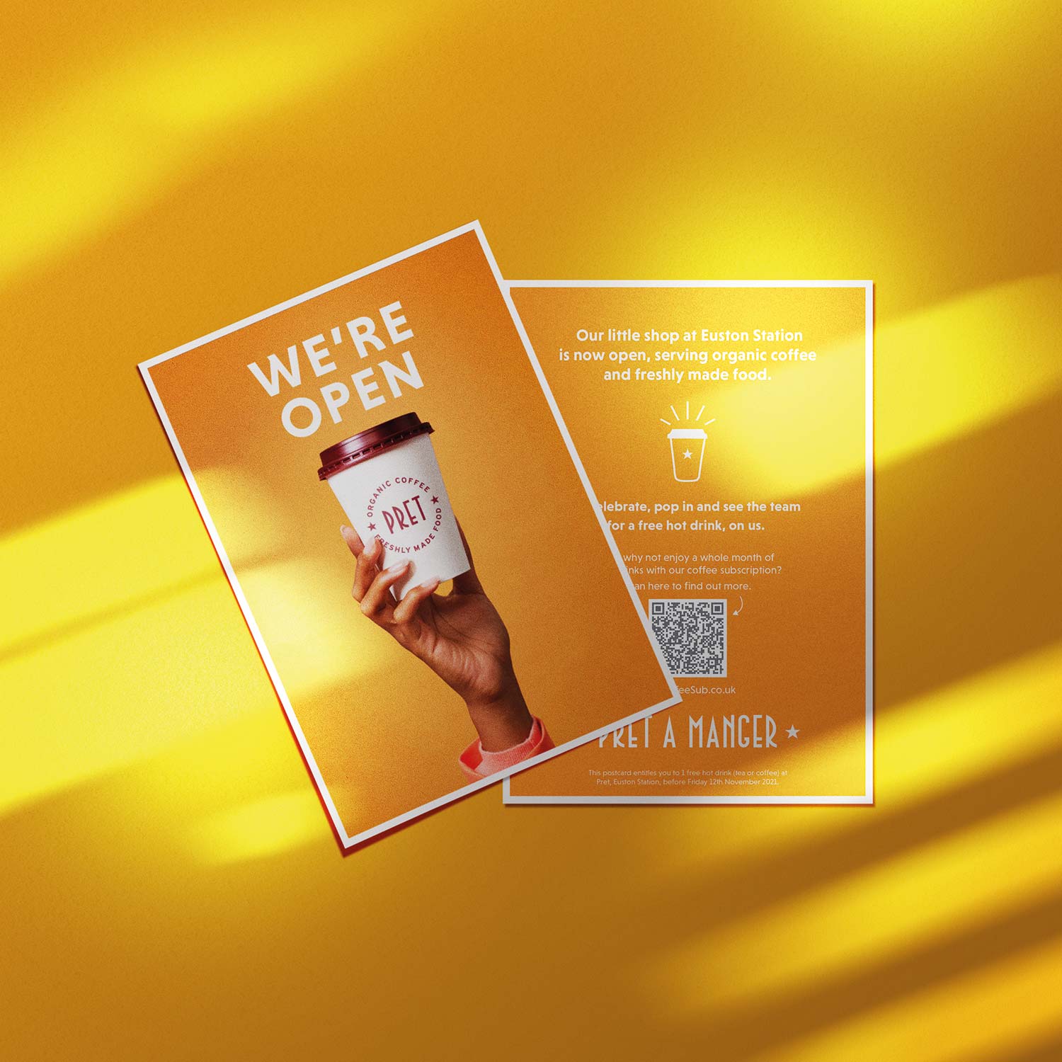
Pret A Manger

The Graft Coworking
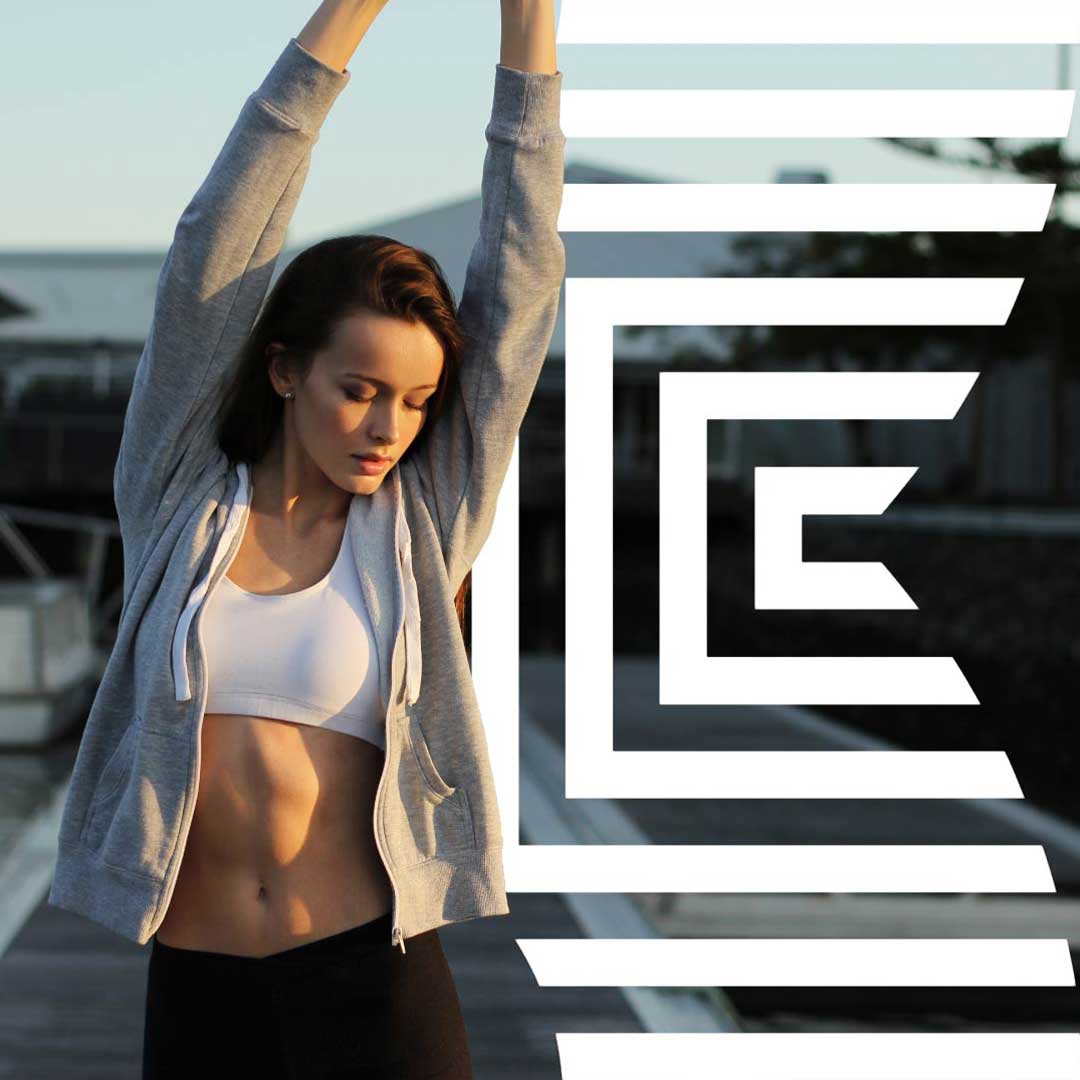
Exoro

Ice Cream Parlor

The Good Knight Co
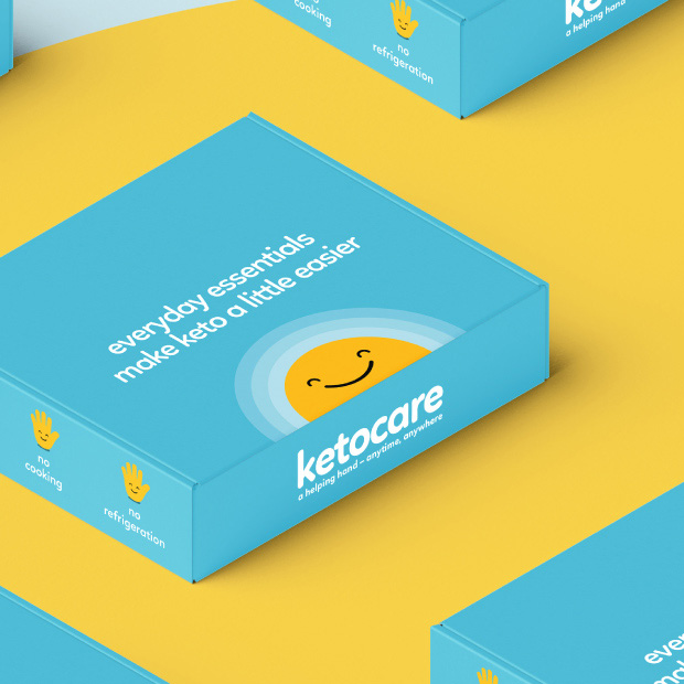
Keto Care
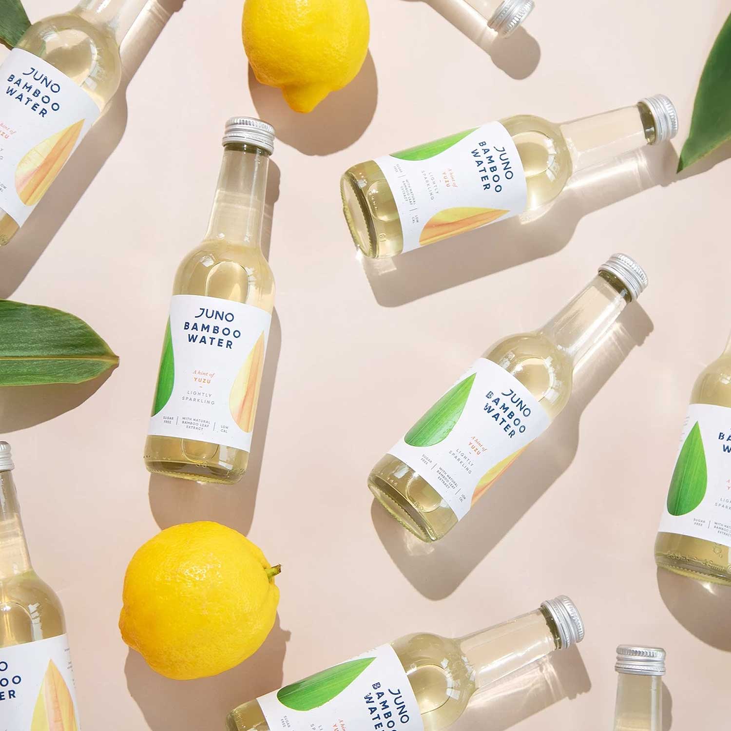
Juno Bamboo Water

Wipeless

CHHABRA

The Kraken

Raw Ecstasy
Pernod Ricard
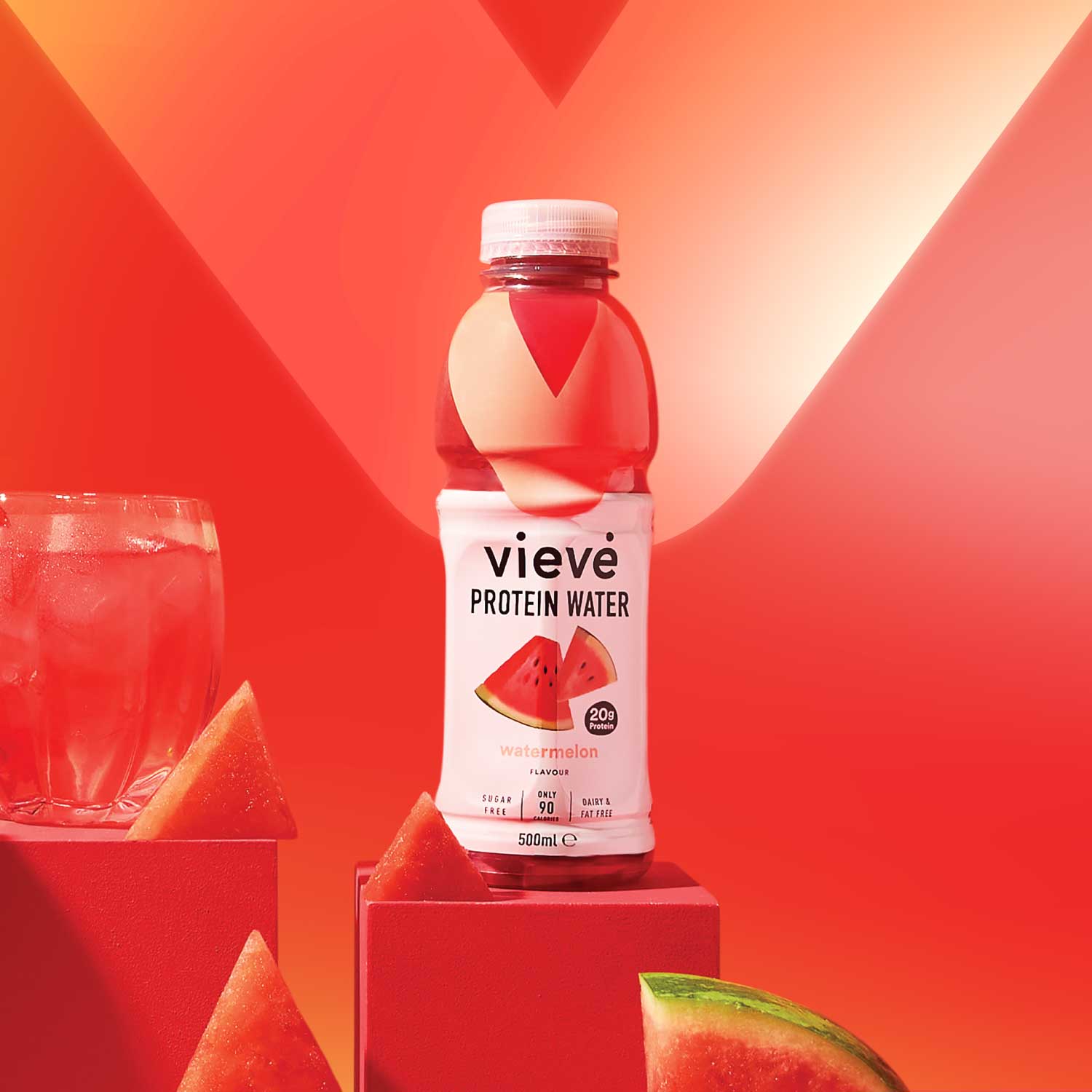
Vieve Protein Water

Wishbone

Chesterfield Theatres
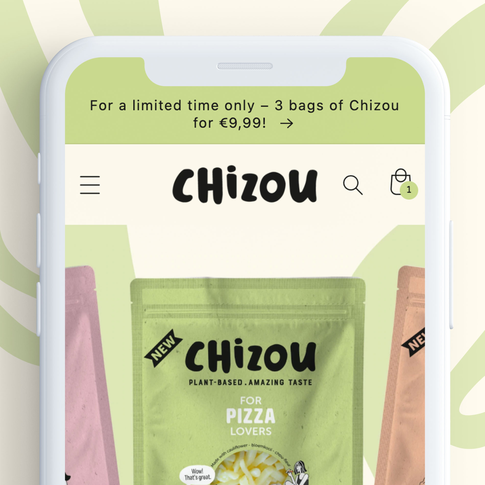
Chizou

The Well Bean Co
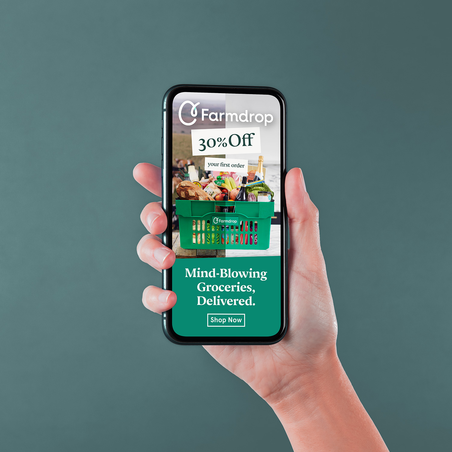
Farmdrop

Riviera Iced Tea

Content Marketing