

Do you have a packaging design project on the horizon? Looking to up your knowledge of packaging design terms and confusing jargon?
Here we’ve compiled a list of the most common terms and tips as a handy go-to packaging design guide.
Bleed
An area which extends past the cutting area. This allows the printer a small degree of space from the movement of paper. For average size print jobs, the industry standard is 3mm on all sides.
Blind
Can be referred to as a ‘blind emboss’, ‘blind deboss’ etc. This means that the treatment has been made but no colour/foil has been applied which results in a subtle and elegant mark in the paper/material.
Closed Loop Packaging
Closed-loop is a packaging system whereby packaging waste is collected, recycled and used again to make the same packaging.
Cold Foil
A general term to describe a foil application. Cold foil can be applied faster and more economically as it does not require ‘tooling’ or a die created. Applied using a UV and adhesive.
Copy
Meaning content or raw material for the packaging design. This could be text, images, artwork etc…
Cropmarks / Trim Marks
Show the printer where the paper needs to be trimmed.
Cutter Guide also known as ‘Dieline’
The cutter guide is the shape to be cut out. Generally in packaging design when we mention this we will be referring to the ‘packaging net’, the physical shape of the packaging.
Die Cut
Die-cutting is the process of cutting a shape out of a material using a ‘die’. A sharp metal blade (the die) is created in a particular shape, and then cuts from the material.
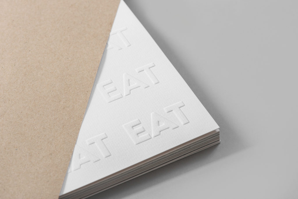
Debossing
A shape pressed into the surface of a design.
Embossing
A shape raised on the surface of a design.
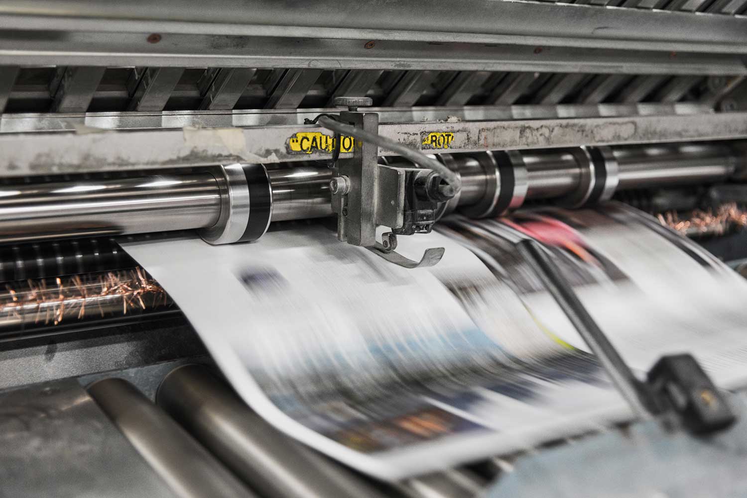
Four Colour Process / CMYK
A way of describing the four colour printing process CMYK – standing for the colours Cyan, Magenta, Yellow and Black or (Key). A percentage of each colour is used to create a spectrum of different colours, these are broken down using individual plates for CMYK – which overlay.
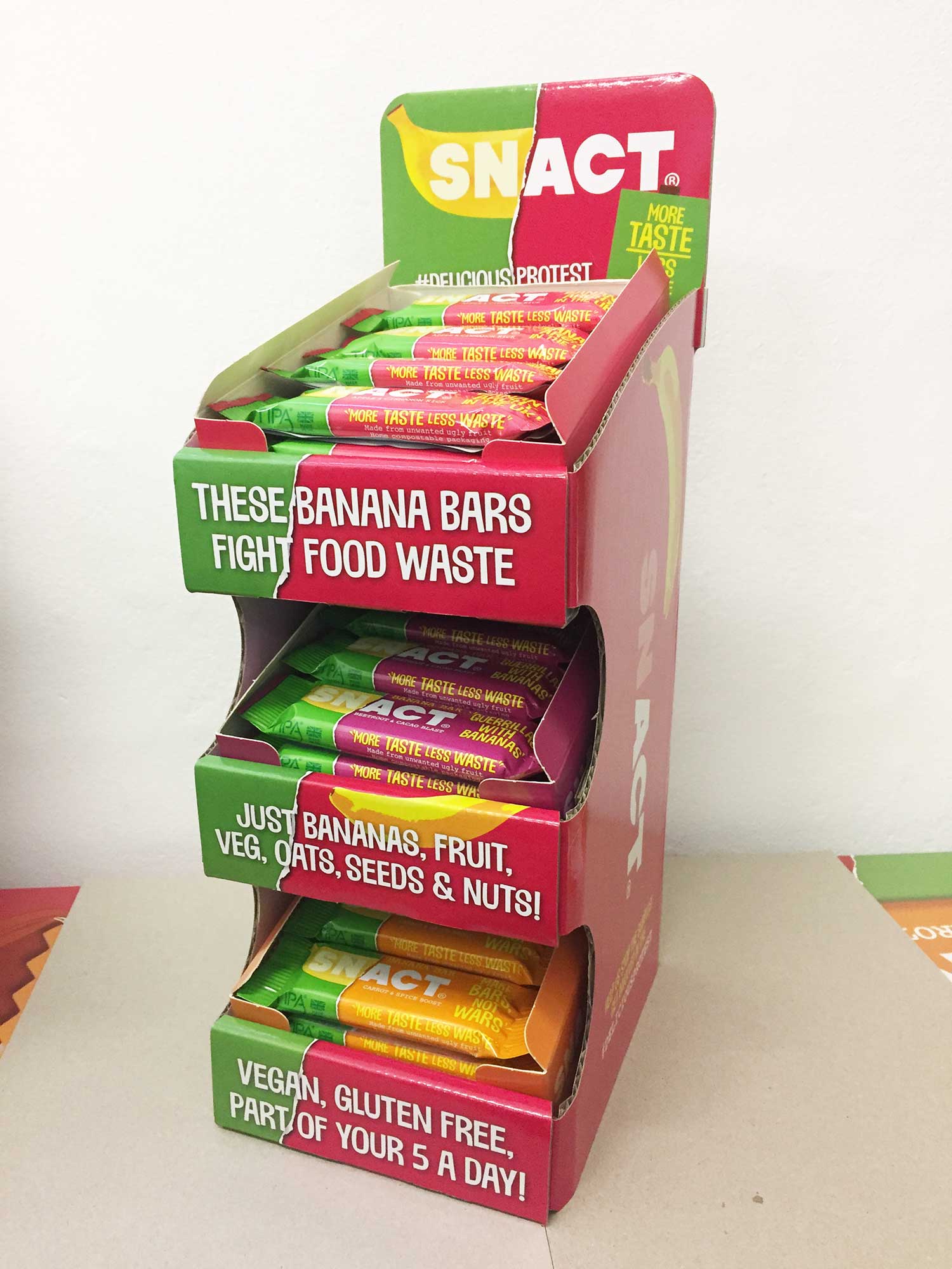
FSDU
Free standing display unit.
Gloss
A shiny surface/material.
Hot Foil
A general term to describe a foil application. Hot foil is the more traditional foiling process which needs to be produced with the use of a die, often meaning it is more expensive. The foil has a slightly raised texture to it lending itself well to luxury and premium packaging and brands.
Kiss Cut
Unlike a die cut – a kiss cut does not cut all the way through material. Instead it lightly ‘kisses’/cuts the paper, making it perfect for stickers and vinyl so the backing paper remains intact and can be easily peeled away.
Matte
A dull surface/material as opposed to a shiny gloss substrate.
Pantone
Pantone is a universal colour matching system and ensures colour accuracy internationally. Each Pantone colour has it’s own reference and can be found in swatches for different types of paper (coated, uncoated etc…).
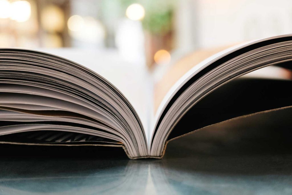
Perfect Bound / Pure Bound
An alternative bookbinding method to saddle stitching. Pages are collated together and then glued together with a book spine. This works well for larger length documents and publications and has a more premium feel to it.
Primary Packaging
The first part of the packaging that a consumer would touch. For example with a chocolate bar this would be the outer paper sleeve.
Saddle Stitched
A way of describing bookbinding which has been created using staples. Pages need to be in multiples of 4 for saddle stitching to be used.
Secondary Packaging
The secondary part of the packaging that a consumer would touch. This part generally keeps a product clean and stops it being tampered with. For example with a chocolate bar – this would be the foil/wrapper which keeps the chocolate fresh and protected.
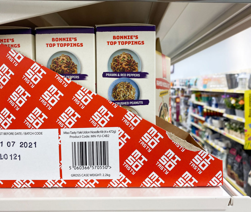
SRP
SRP means ‘Shelf Ready Packaging’ and is the packaging which products are shipped in – and then open up and can be placed directly onto a shelf still standing in this packaging. Generally these are quite hard-wearing corrugated boxes which transport products in volume and display them in a branded way within retail.
Substrate
Any material to be printed on / produced with. Could be a paper, card, plastic, wood etc…
Thermochromic Inks
Thermochromic Inks are heat sensitive and change colour with changing temperate. These are used on products like drink packaging to show if a can is warm or cold.
Window
Meaning product window – the transparent area where we see the product visibly through the packaging.
Looking to discuss a current or upcoming packaging design project?
We work with clients across, packaging and concept, NPD & innovation, retail environment, packaging audits and more.
Sign up to our newsletter for free insights on all things brand, consumer, FMCG & CPG.
More Insights
 FMCG & CPG Marketing Strategy: Free Template
- How To Build A FMCG Brand
- Why Brand Guidelines Are Important – 10 Reasons
- Frozen Food Packaging Design – 5 Key Considerations
- Food Packaging Design – 10 Tips On Labelling Compliance
- FMCG Digital Marketing Strategies on a Shoestring – 8 Ideas
- 7 Tips for Product SKU Naming for FMCG Food & Drink Brands
- Effective Experiential Marketing Activations for FMCG & CPG Consumer Brands – 10 Tips
- Designing Effective SRP Packaging Design for FMCG & CPG Brands – 8 Tips
- Brand Storytelling – 15 Tips for FMCG Brand Storytelling
- Successful Packaging design in DTC & E-Commerce – 8 Tips
- Food Packaging Design – Designing for Limited Editions


